Chapter 16 causact: Quick Inference With Generative DAGs
Figure 15.1: An example of the causact package’s ability to create generative DAGs. This example, often referred to as 8-schools, was popularized by its inclusion in Bayesian Data Analysis (Gelman, Carlin, and Rubin 1997). We will start with simpler models in this chapter.
This chapter illustrates how to use the causact package to reduce the friction experienced while going from business issues to computational models. The package is an easy-to-use, intuitive, and visual interface to numpyro. In fact, it automates the creation of numpyro code based on a user creating a generative DAG. causact advocates and enables generative DAGs to serve as a business analytics workflow (BAW) platform upon which to launch business discussions, create statistical models, and automate computational Bayesian inference.
16.1 Getting Started with dag_foo() Functions
If you run the below code,
library(causact)
library(tidyverse)
## returns a list of data frames to store DAG info
dag_create()

## adds a node to the list with given description
dag_create() %>% dag_node("BernoulliRV")
you will discover that the two lines beginning with dag_ output R list objects consisting of six data frames. Let’s not worry too much about the details, but notice that one of the data frames is for storing node information (i.e. nodesDF) and one for edge information (i.e. edgesDF). Recall, we learned about these nodes and edges in the Graphical Models chapter.
The function dag_create() is used to create an empty list object that we will refer to as a causact_graph. Subsequently functions like dag_node() and dag_edge() will take a causact_graph object as input, modify them, and provide a causact_graph object as output. This feature allows for the chaining (i.e. using %>%) of these functions to build up your observational model. Once done building with dag_create(), dag_node(), and dag_edge(), a call to the dag_render() function outputs a visual depiction of your causact graph. Here is small example of what that code might look like:
Figure 16.1: A minimal working example to render a causact graph. The dag function arguments are detailed in subsequent sections of this chapter.
16.2 Four Steps to Creating Graphical Models
Let’s use the dag_foo() functions to make a generative DAG with Bernoulli data (\(X\)), a uniform prior, and some observed data:
\[ \begin{aligned} X &\sim \textrm{Bernoulli}(\theta) \\ \theta &\sim \textrm{uniform}(0,1) \end{aligned} \]
Assume two successes and one failure such that:
\[ x_1 = 1, x_2 = 1, x_3 = 0 \]
16.2.1 Step 1: Add a node to represent your data
The following code uses the descr and label arguments of the dag_node() function to, respectively, provide a long label for your random variable that is easily understood by business stakeholders and a short label that is more for notational/mathematical convenience:
dag_create() %>%  # just get one node to show
  dag_node(descr = "Store Data", label = "x") %>%
  dag_render()
Since, we actually observe this node as data, we use the data argument of the dag_node() function to specify the observed values The observed values will more often be in a column of a data frame, but giving a vector of actual values also works.:
dag_create() %>%  # make it an observed node
  dag_node(descr = "Store Data", label = "x",
           data = c(1,1,0)) %>%  ##add data
  dag_render()
The node’s darker fill is automated because of the supplied observed data and the [3] means there are three observed realizations in the supplied data vector. You could also use a plate to represent the multiple realizations, but I recommend plate creation to be the last step in creating generative DAGs via the causact package.
16.2.2 Step 2: Represent the distribution governing how the observed data is generated
One goal we often have is to take a sample of data and find plausible parameters within a distribution family (e.g. normal, gamma, etc.) governing how that data might have been generated - at its core, Bayesian inference is a search for plausible parameters of a specified generative DAG. To specify the distribution family governing the observed data, use the rhs argument of the dag_node() function rhs stands for right-hand side. The rhs of a node is reserved for indicating how the node is generated as a function of its parent nodes’ values. Alternatively, when not used as a distribution specification, the rhs is an algebraic expression or other function of data converting parent node values into a realization of the node’s value. There is an implicit assumption that all unknown variables will eventually be defined by parent nodes - the causact package will not check for this. In the case below, we are specifying a parameter theta that will need to eventually be added as a parent node.
Hint: Use CTRL+SPACE or CMD+SPACE to access the auto-complete functionality when looking to add the rhs and data arguments.
dag_create() %>%  # specify data generating distribution
  dag_node(descr = "Store Data", label = "x",
           rhs = bernoulli(theta),  ##add distribution
           data = c(1,1,0)) %>%
  dag_render()
Note, a random variable’s distribution must be part of causact. The full list of causact distributions can be found by running the following line:
16.2.3 Step 3: Add a node for every argument on the rhs
For each unknown argument remaining on the rhs of any nodes in your causact graph, one must eventually All unknown rhs arguments for nodes must be defined prior to running any Bayesain computations. define how the unknown argument can be generated. In our data node above, the only unknown argument on the rhs is theta. We define the generative model for theta by making an additional node representing its value:
dag_create() %>%
  dag_node(descr = "Store Data",
           label = "x",
           rhs = bernoulli(theta), # no quotation marks
           data = c(1,1,0)) %>%
  dag_node(descr = "Success Probability",
           label = "theta",  # labels needs quotes
           rhs = uniform(0,1)) %>%
  dag_render()
Notice, the parameters of the rhs distribution for theta are not unknown - they are actually constants (i.e. 0 and 1) and hence, no additional parent nodes are required to be created. Take note that theta on the rhs for the Store Data node does not require quotes as it refers to an R object; specifically, this refers to the R object created by:
where the theta object is given its name by the label = "theta" argument; The only case for when the label argument is not within quotes will be when the label name itself is stored in a pre-existing R-object. when creating node labels via this argument, quotes are typically required.
16.2.4 Step 4: Link the parent to child
Without a link between theta and x, one is not creating a properly factorizable directed acyclic graph as is required for specifying a joint distribution (see the Graphical Models chapter). When using the child argument, please ensure the child was previously defined as a node. Generative DAGs are designed to be built from bottom-to-top reflecting the way a business analyst would create these DAGs. Note that computer code for Bayesian inference, like numpyro code, requires the exact opposite order - parent nodes get defined prior to their children. One way the causact package accelerates the BAW is by facilitating a bottom-up workflow that can be automatically transalated to top-down computer code. Using the child argument of dag_node, one can now create the required link between theta as a parent node and theta as an argument to the distribution of its child node x:
dag_create() %>%  # connect parent to child
  dag_node(descr = "Store Data", label = "x",
           rhs = bernoulli(theta),
           data = c(1,1,0)) %>%
  dag_node(descr = "Success Probability", label = "theta",
           rhs = uniform(0,1),
           child = "x") %>%  ## ADDED LINE TO CREATE EDGE
  dag_render()
For more complicated modelling, repeat this process of adding parent nodes until there are no uncertain parameters on the right hand side of the top nodes.
16.3 Running Bayesian Inference on a DAG
Now we use dag_numpyro() function to get a posterior distribution based solely on the causact_graph that we just made. A call to dag_numpyro() expects a causact_graph as the first argument, so make sure you are not passing the output of the dag_render() function by mistake. Use dag_render() to get a picture and dag_numpyro() for Bayesian inference - just do not mix them in the same chain of functions. The second argument of dag_numpyro() is the mcmc argument and its default value is TRUE. When mcmc = FALSE, dag_numpyro(mcmc = FALSE) gives a print-out of the numpyro code that would be run by causact to get a posterior without running the code. You can cut and paste this code into a new R-script if you wish and run it there (ESPECIALLY USEFUL FOR DEBUGGING WHEN YOU GET AN ERROR AT THIS STAGE). Alternatively and preferably, the numpyro code should run automatically in the background by setting mcmc = TRUE or simply omitting this argument because it is the default value. Usage is shown below:
# running Bayesian inference
# remove dag_render() and save graph object
graph = dag_create() %>%
  dag_node(descr = "Store Data",
           label = "x",
           rhs = bernoulli(theta),
           data = c(1,1,0)) %>%
  dag_node(descr = "Success Probability",
           label = "theta",
           rhs = uniform(0,1),
           child = "x")
# pass graph to dag_numpyro
drawsDF = graph %>% dag_numpyro()
After some time, during which numpyro computes our posterior Bayesian distribution, we get that distribution as representative sample in an object I typically name drawsDF - a data frame of posterior draws that is now useful for computation and plotting. For a quick visual-check that all went well, pass the drawsDF data frame to the dagp_plot() function to get a quick look at the credible (posterior) values of theta:
Figure 16.2: A quick visualization of a posterior distribution.
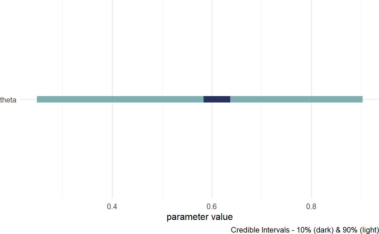
IN 16.2, the lighter fill indicates a \(90\%\) percentile interval where \(5\%\) of plausible values are excluded from the left- and right-sides of the colored interval. Consider this range your credilble values for theta; hence, our posterior belief is that theta is somewhere in the \(27\%\) to \(90\%\) range. The darker fill within the colored interval indicates a \(10\%\) percentile interval; hence, the most likely values of theta are centered around \(60\%\). For more customized graphs, please use ggplot2 or ggdist with drawsDF as the input data.
16.4 Investigating the Posterior Distribution
When investigating the posterior distribution, please note that your representative sample may differ slightly from the sample shown here. Due to some inherent randomness in the way the posterior distribution is generated slight differences in our results are expected.
The object we named drawsDF is our posterior distribution after numpyro automated Bayes rule for us. The posterior distribution is expressed as a representative sample of all unobserved nodes/parameters; it is not a named probability distribution (revisit the Representing Uncertainty chapter for a comparison of the different ways of expressing uncertainty) . Each row of drawsDF is a single individual sample or realization of the posterior distribution. Each row is referred to as a draw from the posterior.
Unlike draw and draws which are singular and plural, respectively - the word sample can refer to either the collection of draws or just one single draw of the joint posterior distribution.
To see a representative sample of the posterior distribution, we access the R object, drawsDF, created above. The theta column of drawsDF contains our representative sample of the posterior distribution. In this case, that representative sample includes 4,000 samples of theta. Recall from Figure ?? that our generative model assumes theta, the probability of success, was uniformly distributed between 0 and 1 (our prior). Now, after observing 2 successes and 1 failure, we should expect our plausibility to favor \(\theta\) values closer to \(2/3\); but we let Bayes rule (via numpyro) do this plausibility updating for us.
To get a refresher on histograms and density curves, check out this constructive video from Khan Academy: https://youtu.be/PUvUQMQ7xQk.
Using ggplot, we can visualize how plausibility was reallocated from our uniform prior of \(\theta\) in light of the observed data; in other words, we can see the posterior distribution for \(\theta\) after observing 2 out of 3 stores increase sales:
## make histogram with bins spaced every 0.025
library(tidyverse)
ggplot(drawsDF, aes(x = theta)) +
  geom_histogram(breaks = seq(0,1,0.025))
Figure 16.3: Histogram of the posterior distribution for theta.
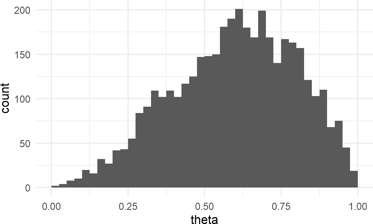
Notice how values of \(\theta\) are are nonger uniformly distributed; values from \(\theta = 50\%\) to \(\theta = 75\%\) are represented more frequently.
Given our training in the tidyverse, we can create a more effective visual; a comparison of prior and posterior (remember to google any functions/packages/etc. you are not familiar with):
library(tidyverse)

# named vector mapping colors to labels
colors = c("Uniform Prior" = "plum",
           "Posterior" = "cadetblue")

# use geom_density to create smoothed histogram
ggplot(drawsDF, aes(x = theta)) +
  geom_area(stat = "function", fun = dunif,
            alpha = 0.5, color = "black",
            aes(fill = "Uniform Prior"))+
  geom_density(aes(fill = "Posterior"),
               alpha = 0.5) +
  scale_fill_manual(values = colors) +
  labs(y = "Probability Density",
       fill = "Distribution Type")
Figure 16.4: Comparison of prior and posterior probability density function estimates.
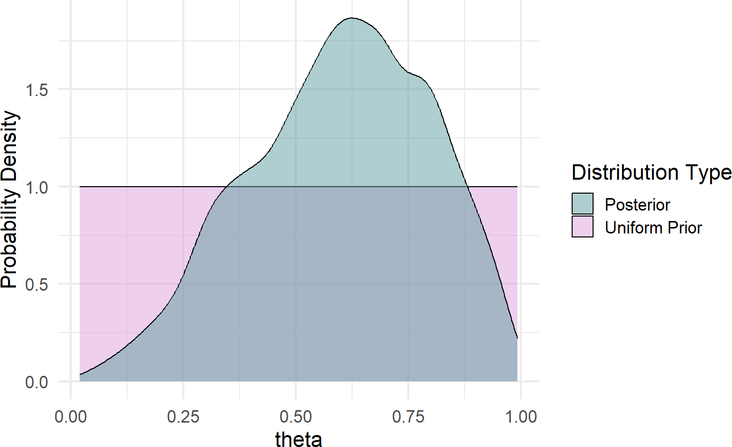
Some takeaways from Figure 16.4 regarding plausibility reallocation:
- Low values of \(\theta (\approx < 30\%)\) are now deemed less plausible; two out of three successes is simply inconsistent with low values of \(\theta\).
- Very high values of \(\theta (\approx > 90\%)\) are less plausbile; one failure in three tries is not likely to occur if \(\theta\) were to be super-high.
- Our best guess at \(\theta\) went from 0.5 (i.e. the mean of theta when uniformly distributed) to
mean(drawsDF$theta) =0.605.
- We are still very unsure of \(\theta\) after only 3 stores. We can see this by looking at quantiles of the posterior distribution suggesting a 90% percentile interval from 0.257 to 0.899:
See here for more details about interpreting a quantile function: https://en.wikipedia.org/wiki/Quantile_function.
##        5%       50%       95%
## 0.2569866 0.6245710 0.8990837
This continued large band of uncertainty is a good thing. We only have three data points, we should not be very confident in \(\theta\). If we want a tighter interval of uncertainty, then we simply need to get more data. Exploring more data, different models, and other priors are all coming in subsequent chapters.
16.5 Making Probabilistic Statements With Indicator Functions
With a representative sample of the posterior joint distribution available to us, namely drawsDF, we can expand on the strategies of the “Joint Distributions Tell Us Everything” chapter to make probabilistic statements from representative samples. For example, we might be curious to know \(P(\theta > 50\%)\). Using indicator functions, simple functions that equal 1 when a criteria is met and 0 when it is not, we can get our estimate that \(P(\theta > 50\%)\).\(^{**}\): ** Representative samples from posterior distributions will vary each time you run the code. Hence, if using a different random seed, your answer might be slightly different than the one shown here.
## estimate that theta > 50 percent
drawsDF %>%
  mutate(indicatorFlag =
           ifelse(theta > 0.5, TRUE, FALSE)) %>%
  summarize(pctOfThetaVals = mean(indicatorFlag))
## # A tibble: 1 × 1
## pctOfThetaVals
## <dbl>
## 1 0.704We would then state that “the probability that \(\theta\) is greater than \(50\%\) is approximately 70%”.
Similarly, we can answer more complicated queries. For example, what is the \(P(40\% < \theta < 60\%)\):
## estimate that 40% < theta < 60%
drawsDF %>%
  mutate(indicatorFlag =
           ifelse(theta > 0.4 & theta < 0.6,
                  TRUE, FALSE)) %>%
  summarize(pctOfThetaVals = mean(indicatorFlag))
## # A tibble: 1 × 1
## pctOfThetaVals
## <dbl>
## 1 0.294The power of this workflow cannot be overstated and you will use it frequently for making probabilistic statements. Statements that will come in handy when it is time to use data to inform decision making under uncertainty.
See section 7.2 for a refresher on the type of computations that can help you count the percentage of values in a data frame column that match a certain criteria. As another example, let’s compute \(P(\theta > 65\%)\) using the indicator function trick we just learned:
drawsDF %>%
  mutate(indicatorFlag =
           ifelse(theta > 0.65, TRUE, FALSE)) %>%
  summarize(pctOfThetaVals = mean(indicatorFlag))
## # A tibble: 1 × 1
## pctOfThetaVals
## <dbl>
## 1 0.450A more descriptive output, possibly used for plotting purposes, is shown here:
# get P(theta>0.65) using dplyr recipe
drawsDF %>%
  mutate(indicatorFlag =
           ifelse(theta > 0.65,
                  "theta > 0.65",
                  "theta <= 0.65")) %>%
  group_by(indicatorFlag) %>%
  summarize(countInstances = n()) %>%
  mutate(percentageOfInstances =
           countInstances / sum(countInstances))
## # A tibble: 2 × 3
## indicatorFlag countInstances percentageOfInstances
## <chr> <int> <dbl>
## 1 theta <= 0.65 2201 0.550
## 2 theta > 0.65 1799 0.45016.6 A Little Bit of Math To Understand Indicator Functions
To make a probabilistic statement of the form “the probability that outcome X meets this criteria is Y%”, the previous section computed the mean of an indicator function. Why does this work? Let’s delve into the math for a moment just to see why.
An indicator function, denoted \(\mathbb{1}_{A}\) maps all values of a representative sample \(X\) to either 0 or 1 depending on whether the values satisfy criteria to be in some set we label as \(A\). For example, assume \(A = \{x \geq 0.5\}\) is math set notation for all values in representative sample \(X\) such that the draw satisfied \(x \geq 0.5\). Then the formal definition of an indicator function, denoted \(\mathbb{1}_{A}\), is mapping of elements in \(X\) to either 0 or 1 depending on whether the are in \(A\):
\[ \mathbb{1}_{A} \equiv \begin{cases} 1, & \textrm{if } x \in A\\ 0, & \textrm{if } x \notin A \end{cases} \]
Now, for the key math trick, known as the fundamental bridge. The probability of an event is the expected value (i.e. mean) of its indicator random variable. Mathematically,
\[ P(A) = \mathbb{E}[\mathbb{1}_{A}] \tag{16.1} \]
which is true since \(\mathbb{E}[\mathbb{1}_{A}] = 1 \times P(A) + 0 \times P(\bar{A}) = P(A)\) where \(\bar{A}\) denotes not in set \(A\). So, using (16.1) we can make probabilistic statements about a realization \(x\) meeting the criteria to be in set \(A\). Assuming \(J\) draws in our data frame, each draw labelled \(j\), then we estimate \(P(A)\) by taking the average value of an indicator function over the \(J\) draws:
\[ P(A) = \mathbb{E}[\mathbb{1}_{A}] \approx \frac{1}{J} \sum_{j=1}^J \mathbb{1}_{x_j \in A} \] And despite the heavy math notation, your intuition can guide you in applying this formula. For example, imagine we have a representative sample of \(X = [1,4,3,2,5]\) and we want to estimate \(P(X \geq 3)\). You could answer this just by looking and say \(\tfrac{3}{5}\) or 3 out of 5 chances for \(x \geq 3\). Applying the formula, which we could easily do with code, is shown mathematically here:
\[ P(x \geq 3) = \mathbb{E}[\mathbb{1}_{x \geq 3}] \approx \frac{1}{5} \sum_{j=1}^5 \mathbb{1}_{x_j \geq 3} = \frac{1}{5} \times (0+1+1+0+1) = \frac{3}{5} = 60\% \] We have a probabilistic statement: “the probability that \(x\) is greater than or equal to 3 is 60%”.
16.7 The Credit Card Example Revisited
 Figure 16.5: The credit card example from the Graphical Models chapter will be analyzed in this chapter using the causact package.
In the Graphical Models chapter, we presented the case where prospective credit card applicants were being segmented based on the car they drove. A dataset to accompany this story is built-in to the causact package:
# ------------------------------------
# Revisiting the Get Credit Card Model
# ------------------------------------

# data included in the causact package
# 1,000 customers and the car they drive
carModelDF   #show data
## # A tibble: 1,000 × 3
## # Rowwise:
## customerID carModel getCard
## <int> <chr> <int>
## 1 1 Toyota Corolla 0
## 2 2 Subaru Outback 1
## 3 3 Toyota Corolla 0
## 4 4 Subaru Outback 0
## 5 5 Kia Forte 1
## 6 6 Toyota Corolla 0
## 7 7 Toyota Corolla 0
## 8 8 Subaru Outback 1
## 9 9 Toyota Corolla 0
## 10 10 Toyota Corolla 0
## # ℹ 990 more rowsFigure 16.6 revisits the initial graphical model using functionality from the causact package:
graph = dag_create() %>%
  dag_node("Get Card","x",) %>%
  dag_node("Car Model","y",
           child = "x")
graph %>% dag_render(shortLabel = TRUE)
Figure 16.6: Graphical model for a prospective customer getting the credit card without looking at the car they drive.
Notice the shortLabel = TRUE argument. This presents a useful graph to share with business stakeholders (see Figure 16.6). It avoids all math notation and statistical jargon, yet still conveys the essence of your modelling choices/approach.
To make this a generative DAG, we take a bottom-up approach starting with our target measurement Get Card and add in the mathematical and data details:
graph = dag_create() %>%
  dag_node("Get Card","x",
           rhs = bernoulli(theta),
           data = carModelDF$getCard)
graph %>% dag_render()
To model subsequent nodes, we consider any parameters on the right-hand side of the statistical model that remain undefined. Hence, for \(x \sim \textrm{Bernoulli}(\theta)\), \(\theta\) should be a parent node in the graphical model and will also require definition in the statistical model. And at this point, we say ay caramba!. There is a mismatch between Car Model, the parent of Get Card in the graphical model of Figure 16.6, and \(\theta\), the implied parent of Get Card in the statistical model which would represent Signup Probability.
In this case, we realize that Signup Probability is truly the variable of interest - we are interested in the probability of someone signing up for the card, not what car they drive. Ultimately, we want Signup Probability as a function of the car they drive, but let’s move incrementally. Figure 14.1 graphically models the probability of sign-up (\(\theta\)) as the parent, and not the actual car model.
graph = dag_create() %>%
  dag_node("Get Card","x",
           rhs = bernoulli(theta),
           data = carModelDF$getCard) %>%
  dag_node("Signup Probability","theta",
           rhs = uniform(0,1),
           child = "x")
graph %>% dag_render()
Figure 16.7: A generative DAG for the credit card example.
Using Figure 16.7, the generative recipe implies there is only one true \(\theta\) value and all 1,000 Bernoulli observations are outcomes of Bernoulli trials using that one \(\theta\) value. We can get the posterior distribution under this assumption:
Figure 16.8: Posterior distribution for the probability of a prospective customer getting the credit card without looking at the car they drive.
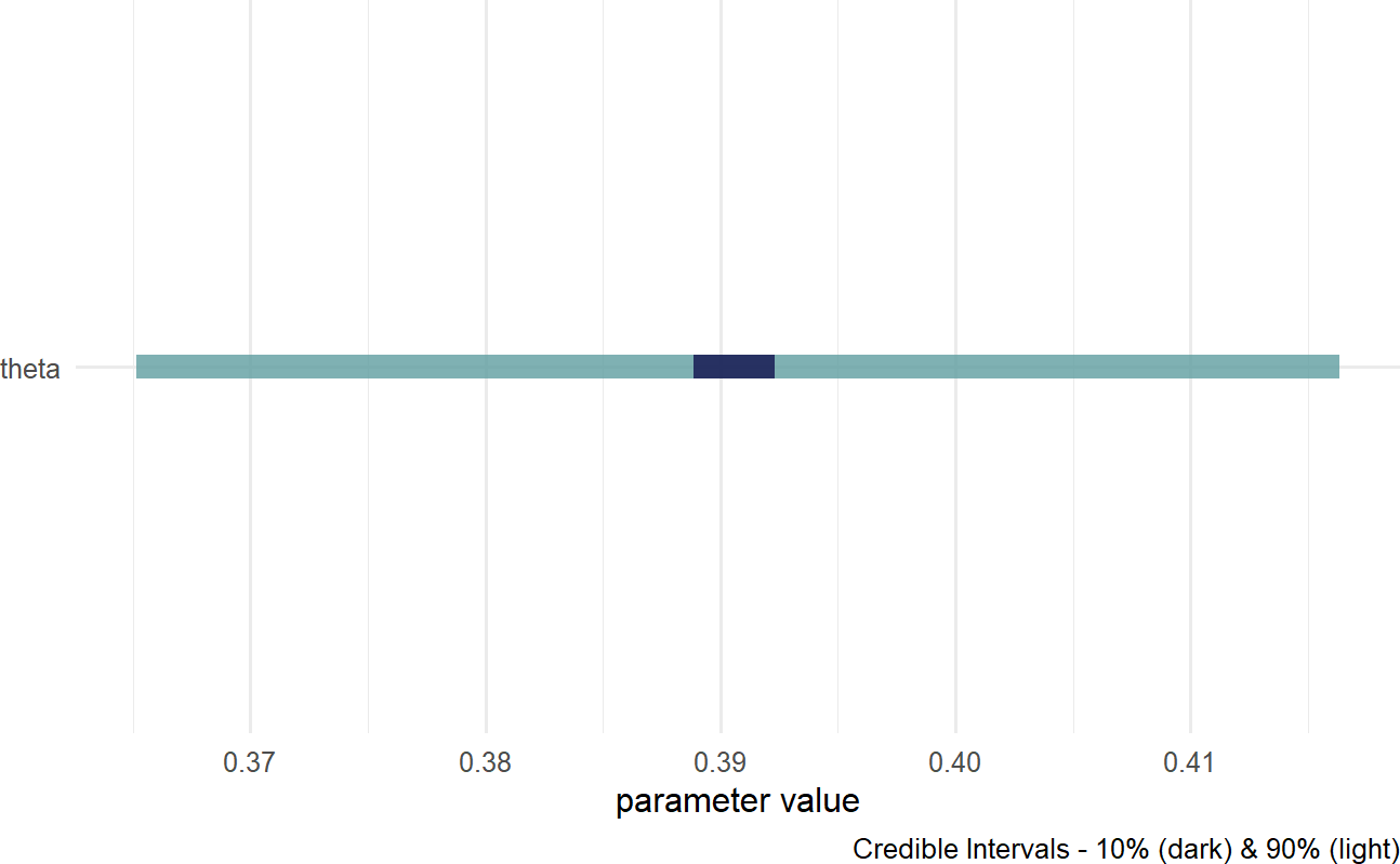
Based on Figure 16.8, a reasonable conclusion might be that plausible values for Signup Probability lie (roughly) between 37% and 42%.
16.7.1 dag_plate()
Our business narrative calls for the probability to change based on car model. The dag_plate() function can then be called upon to create a generative DAG where theta will vary based on car model. A major difference in the direct use of numpyro and its indirect use via causact is that the causact package shifts the burden of index creation to the computer. A plate signifies that the random variables inside of it should be repeated; thus, any oval inside a plate is indexed behind the scenes and effectively, a repeat instance is created for each member of the plate. The system automatically adds the index to the model using the plate label for indexing notation. When using dag_plate() the following arguments prove most useful:
Remember, you can use ?dag_foo,
e.g. ?dag_plate, to get descriptions for all available
function arguments from the help system.
descr- a character string representing a longer more descriptive label for the cluster/plate.label- a short character string to use as an index label when generating code.data- a vector representing the categorical data whose unique values become the plate index. When using withaddDataNode = TRUE, ensure this vector represents observations of a variable whose unique values can be coerced to a factor. Omit this argument andcausactassumes that node replication is based on observations of any observed nodes within the plate.nodeLabels- a character vector of node labels or descriptions to include in the list of nodes that get repeated one time per index value. Labels must be defined already within the specification of thecausact_graph_.addDataNode- a logical value. WhenaddDataNode = TRUE, the code adds a node of observed data, in addition to the plate, based on the supplieddataargument value. This node is used to extract the proper index when any of the nodes in the plate are fed to children nodes. Verify the graphical model usingdag_render()to ensure correct behavior.
Figure 16.9 shows how we can change the generative DAG to accomodate the story of Signup Probability being different for drivers of different cars.
### Now vary your modelling of theta by car model
### we use the plate notation to say
### "create a copy of theta for each unique car model
graph = dag_create() %>%
  dag_node("Get Card","x",
           rhs = bernoulli(theta),
           data = carModelDF$getCard) %>%
  dag_node(descr = "Signup Probability",
           label = "theta",
           rhs = uniform(0,1),
           child = "x") %>%
  dag_plate(descr = "Car Model",
            label = "y",
            data = carModelDF$carModel, #plate labels
            nodeLabels = "theta",  # node on plate
            addDataNode = TRUE)  # create obs. node
graph %>% dag_render()
Figure 16.9: Estimating the probability of a prospective customer getting the credit card as a function of the car they drive.
Take time to play with plates before moving on. The generative DAG in Figure 16.9 added one additional function call, dag_plate(). That addition resulted in both the creation of the plate, and also the additional node representing Car Model observations. Each of the 1,000 observed customers of the Car Model node were driving one of 4 unique car models of the Car Model plate. The indexing of theta by y, i.e. the theta[y] on the rhs of the Get Card node extracts one of the 4 \(\theta\)-values to used to spawn each observation of \(x\).
Expert tip: Observed-discrete random variables, like car model, are best modelled via plates. Do not rush to add nodes or indexes for these random variables. Let dag_plate() do the work for you.
Now, when we get the posterior distribution from our code, we get a representative sample of four \(\theta\) values instead of one.
Visualizing the posterior using the below code yields Figure 16.10.
Figure 16.10: Posterior distribution for theta based on car model.
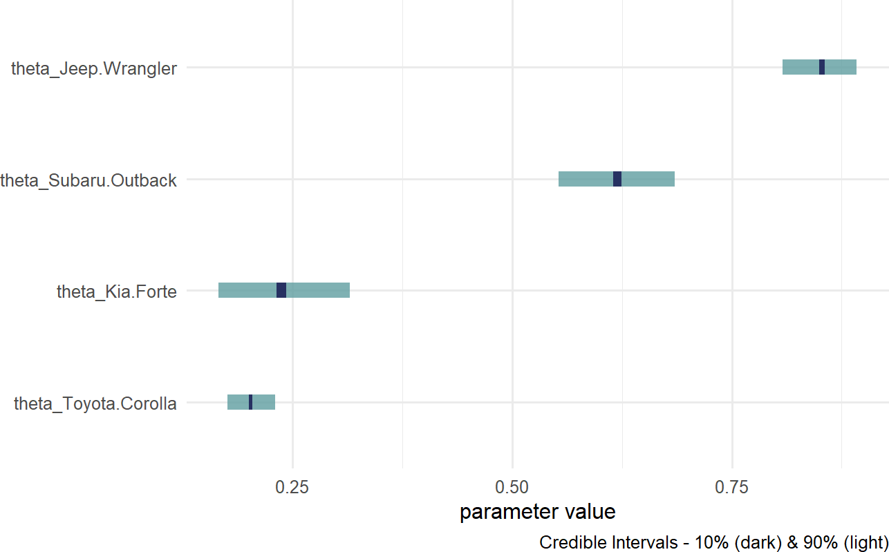
Notice, the index names for the four theta values are automatically generated as abbreviated versions of the unique labels found in carModelDF$carModel.
Digesting Figure 16.10, there are a couple of things to draw attention to. First, interval widths are different for the different theta values. For example, the probability interval for the Toyota Corolla is more narrow than the interval for the other cars. This is simply because there is more data regarding Toyota Corolla drivers than the other vehicles. With more data, we get more confident in our estimate. Here is a quick way to see the distribution of car models across our observations:
## # A tibble: 4 × 2
##   carModel       numOfObservations
##   <chr>                      <int>
## 1 Jeep Wrangler                193
## 2 Kia Forte                     86
## 3 Subaru Outback               145
## 4 Toyota Corolla               576
Second, notice the overlapping beliefs regarding the true sign-up probability for drivers of the Toyota Corolla and Kia Forte. Based on this, a reasonable query might be what is the probability that theta_Kia.Forte > theta_Toyota.Corolla? As usual, we use an indicator function on the posterior draws to answer the question. This time though, we look at the representative sample of two random variables and recognize each row of the posterior is a realization of the joint probability distribution. So, to answer “what is the probability that theta_Kia.Forte > theta_Toyota.Corolla?” Note: this type of query can only be answered by relying on Bayesian inference, we compute:
drawsDF %>%
  mutate(indicatorFunction =
           ifelse(theta_Kia.Forte > theta_Toyota.Corolla,
                  1,0)) %>%
  summarize(pctOfDraws = mean(indicatorFunction))
## # A tibble: 1 × 1
## pctOfDraws
## <dbl>
## 1 0.768Note: You can shorten this code
indicatorFunction = ifelse(theta_Kia.Forte > theta_Toyota.Corolla,1,0)
to just
indicatorFunction = theta_Kia.Forte > theta_Toyota.Corolla.
The logical comparison outputs the ones and zeroes automatically. We
will stick with the longer, but more-easily-readable code.
And using this ability to make probabalistic statements, one might say “there is an approximately 77% chance that Kia Forte drivers are more likely than Toyota Corolla drivers to sign up for the credit card.
16.8 Putting A Plate Around The Observed Random Variables
In Figure 16.9, the bracketed [1000] next to the node descriptions tells us that the observed data has 1,000 elements. Often, for visual clarity, I like to make a plate of observations and have the observed nodes revert back to representing single realizations. This is done by creating a second plate, but now excluding the data argument in the additional call to dag_plate:
graph = dag_create() %>%
  dag_node("Get Card","x",
           rhs = bernoulli(theta),
           data = carModelDF$getCard) %>%
  dag_node("Signup Probability","theta",
           rhs = uniform(0,1),
           child = "x") %>%
  dag_plate("Car Model", "y",
            data = carModelDF$carModel,
            nodeLabels = "theta",
            addDataNode = TRUE)  %>%
  dag_plate("Observations", "i",
            nodeLabels = c("x","y"))
dag_plate() now infers the number of repetitions from the observed values within the plate. The generative DAG in Figure 16.11 reflects this change, yet remains computationally equivalent to the previous DAG of Figure 16.9.
Figure 16.11: Using a plate for observations in addition to the plate for car models.
The code change to produce Figure 16.9 is completely optional, but I use the extra plate in my daily work to add clarity for both myself and my collaborators in a data analysis.
16.9 Getting Help
The causact package is actively being developed. Please post any questions or bugs as a github issue at: https://github.com/flyaflya/causact/issues.
If you are interested in understanding how the representative sample is computed, see Michael Betancourt’s excellent videos on Scaleable Bayesian Inference with Hamiltonian Monte Carlo (HMC). HMC is the computational technique used by numpyro when computing the representative sample from the posterior distribution. The videos are available at https://betanalpha.github.io/speaking/.