Chapter 8 ggplot2: Data Visualization Using The Grammar of Graphics
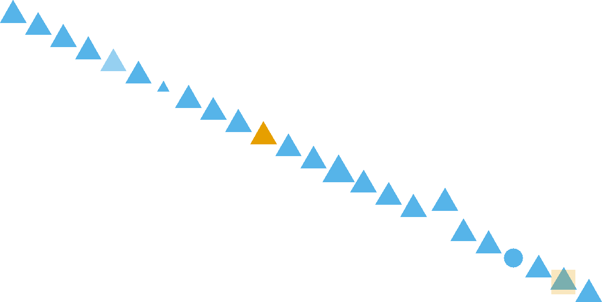
Figure 8.1: How many pattern violations do you see?
A large portion of thoughts and concepts in this chapter are inspired by Noah Ilinsky. See his talk here: (https://youtu.be/R-oiKt7bUU8)
8.1 Why Visualize Data?
Visualization makes data accessible to the human brain. Evolution has wired our eyes and brain to be very sophisticated in pattern recognition. This includes detecting patterns and violations of patterns in regards to position, color, size, shape, gaps, trends, etc. For example, in Figure 8.1, your brain will easily detect seven pattern violations.
To take advantage of the facile nature with which our eyes digest visual information, we will learn to map data - like a column of a data frame - to properties of visual markings made on the screen or on paper. These properties, called aesthetics, include things like position, shape, color, and transparency. By intelligently mapping data to aesthetics, we can not only see our data, but lead ourselves and our audience to visual insight.
8.1.1 Anscombe’s Quartet: A Case For Visual Revelation
Data presented in tables or even in statistical summaries are rarely as forthcoming with insight as is a good visualization. Anscombe (1973Anscombe, F. J. 1973. “Graphs in Statistical Analysis.” The American Statistician 27 (1): 17–21.) constructed four fictitious datasets to illustrate this point - each dataset consisting of x-y value pairs: {(x1,y1),(x2,y2),(x3,y3),(x4,y4)}. The four datasets, known as Anscombe’s quartet, have virtually indiscernible statistical properties. However, the distinguishing characteristics of each dataset are very evident when graphed. Due to the cogency of the arguments made by Anscombe, R programmers include the anscombe dataset as aprt of the R installation. We can see the data in tabulated form using the following lines:
library("dplyr")

## retrieve the anscombe dataset
ansDF = anscombe %>% as_tibble()

# notice the x-values for the first three datasets
# are the same and scanning the y-values yields
# little insight
ansDF
## # A tibble: 11 × 8
## x1 x2 x3 x4 y1 y2 y3 y4
## <dbl> <dbl> <dbl> <dbl> <dbl> <dbl> <dbl> <dbl>
## 1 10 10 10 8 8.04 9.14 7.46 6.58
## 2 8 8 8 8 6.95 8.14 6.77 5.76
## 3 13 13 13 8 7.58 8.74 12.7 7.71
## 4 9 9 9 8 8.81 8.77 7.11 8.84
## 5 11 11 11 8 8.33 9.26 7.81 8.47
## 6 14 14 14 8 9.96 8.1 8.84 7.04
## 7 6 6 6 8 7.24 6.13 6.08 5.25
## 8 4 4 4 19 4.26 3.1 5.39 12.5
## 9 12 12 12 8 10.8 9.13 8.15 5.56
## 10 7 7 7 8 4.82 7.26 6.42 7.91
## 11 5 5 5 8 5.68 4.74 5.73 6.89Notice how the x-values for each of the first three datasets, (i.e. x1, x2, and x3) are the same, yet patterns in the corresponding y-values (i.e. y1, y2, and y3, respectively) are not easily discernible. This tabulated form of data yields little insight.
One might think that statistical transformations can be used to yield more insight. So let’s try this using a statistical transformation of the data that summarize’s the relationship between respective x’s and y’s using the equation of a line, i.e. a linear regression. The lm function in R can be used to get linear regression output. For this book, basic linear regression knowledge is assumed - for an introduction or refresher on linear regression, please consult OpenIntro’s introductory statistics textbook: https://www.openintro.org/book/os/ Notice (below) that the output for both the slope coefficient (\(\approx 0.5\)) and the y-intercept (\(\approx 3\)) is nearly identical for all four datasets and one might (wrongly) assume the datasets to be quite similar as a result:
model1 = lm(y1 ~ x1, data = ansDF)  ##predict y1 using x1
model2 = lm(y2 ~ x2, data = ansDF)  ##predict y2 using x2
model3 = lm(y3 ~ x3, data = ansDF)  ##predict y3 using x3
model4 = lm(y4 ~ x4, data = ansDF)  ##predict y4 using x4
##show results of regression (i.e. intercept and slope)
coef(model1)
## (Intercept) x1
## 3.0000909 0.5000909## (Intercept) x2
## 3.000909 0.500000## (Intercept) x3
## 3.0024545 0.4997273## (Intercept) x4
## 3.0017273 0.4999091Despite the statistical transformation (i.e. regression output) yielding nearly identical insights, visualizing the data, as shown in Figure 8.2, tells a much richer story; the type of story we want to tell as we use data visualization for both exploratory analysis and managerial persuasion.
Figure 8.2: This visual depiction of Ansombe’s quartet yields much more insight than simply viewing the data in tabular form or relying on output of a linear regression.
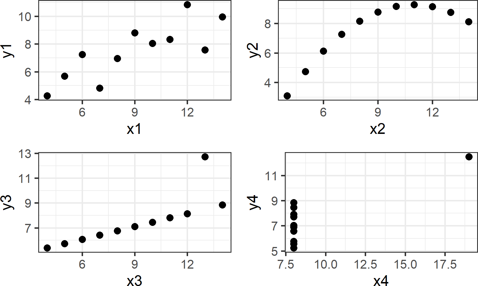
Going forward, I will ask you to change the way you look at plots such as those shown above. Specifically, I request that you think of plots as representing a mapping of data to visual properties which you see on a screen or a piece of paper. To this end, take notice of the visual markings in each of the four plots. For each plot, one X column and one Y column is extracted - these are your data. For example,
## # A tibble: 11 × 2
##       x2    y2
##    <dbl> <dbl>
##  1    10  9.14
##  2     8  8.14
##  3    13  8.74
##  4     9  8.77
##  5    11  9.26
##  6    14  8.1
##  7     6  6.13
##  8     4  3.1
##  9    12  9.13
## 10     7  7.26
## 11     5  4.74
yields 11 rows (or observations) of \((x,y)\) pairs for the upper-right plot of Figure 8.2. For each observation, the \(x\)-value is mapped to horizontal position and the \(y\)-value is mapped to vertical position: \[ \begin{aligned} \textrm{x} &\rightarrow \textrm{horizontal postion}\\ \textrm{y} &\rightarrow \textrm{vertical postion}\\ \end{aligned} \] To display the mapped visual aesthetics, a geom or visual marker is used - in our example this geom was chosen to be points: \[ \textrm{geom} = \textrm{points} \] An alternative aesthetic mapping and geom selection would be the following:
\[ \begin{aligned} x &\rightarrow \textrm{horizontal position}\\ y &\rightarrow \textrm{fill color}\\ \textrm{geom} &= \textrm{rectangular bar} \end{aligned} \]
Figure 8.3: Plot showing an alternative mapping of data to aesthetics and alternative geom. Notice this plot is less effective at revealing the pattern seen in the previous plot.
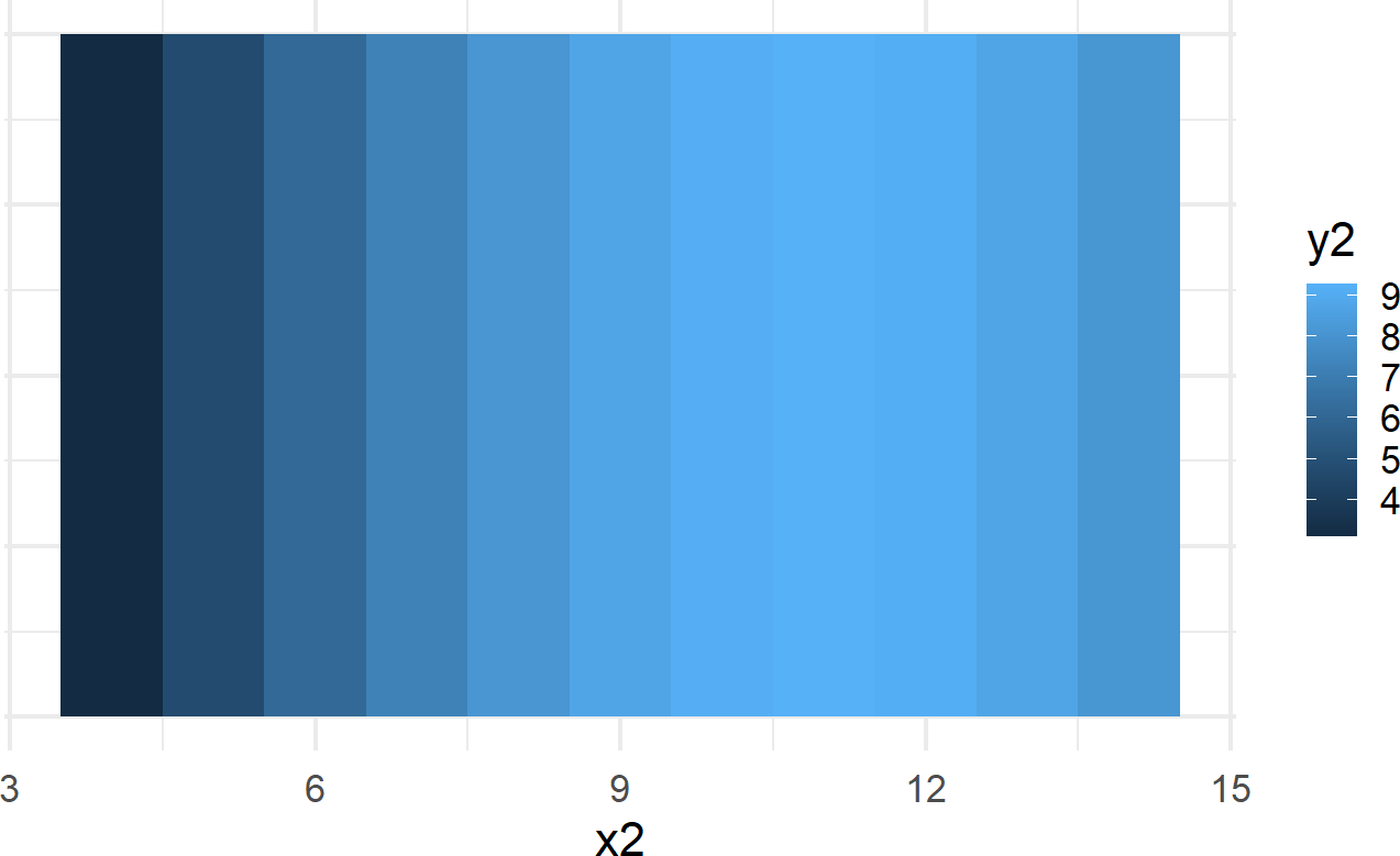
While Figure 8.2 (upper right-hand plot) is far superior in revealing the curvilinear relationship between \(x2\) and \(y2\) than Figure 8.3, they both are representations of the exact same data. For example, notice the maximum \(y2\) value of Figure 8.2 is now represented by the lightest shading in Figure 8.3; both are viusal representation of the exact same data point \((x2,y2) = (11,9.26)\) with the first representation being the more usful of the two.
The key lessons to takeaway from this exploration of Anscombe’s quartet are the following:
- Tabulated data is a struggle to read and obscures discovery of patterns or relationships.
- Statistical transformations tell stories, but the true story of the underlying data might be missed if not visualized.
- Graphing data enables us to readily see patterns that tabulation or statistical tests fail to help us with.
- Mapping of data to aesthetic properties and visualization using different geoms impact the effectiveness of a visualization’s ability to reveal underlying patterns in the data.
8.2 ggplot2: Using the Grammar of Graphics
In this section, we show how to specify the mapping of data to aesthetic properties and visual markings using the ggplot2 package (Wickham 2009Wickham, Hadley. 2009. Ggplot2 Elegant Graphics for Data Analysis. Springer-Verlag New York. http://ggplot2.org.) that is part of the tidyverse package group (Wickham 2017Wickham, Hadley. 2017. Tidyverse: Easily Install and Load the ’Tidyverse’. https://CRAN.R-project.org/package=tidyverse.). The mapping is accomplished via a set of rules known as the grammar of graphics.
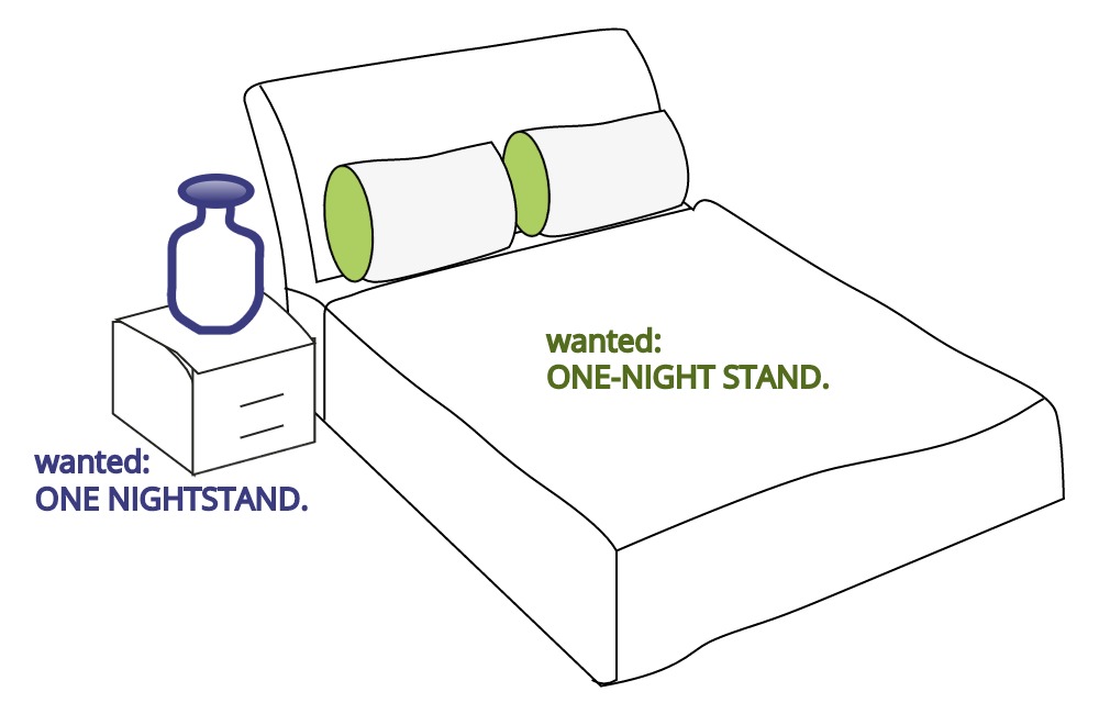
In language, rules of grammar are used to convey meaning when words are combined. For example, Figure 8.4 is similar to a meme circulating on Facebook that shows how English grammar, in this case spacing and the use of a hyphen, changes the meaning of words.
Figure 8.4: Grammar helps to convey meaning efficiently. Humorously, this cartoon compares the grammatical implications of spacing and hyphens. A one-night stand is suggestive of a short romantic encounter whereas a nightstand is simply a bedside table.
Through these rules, readers can correctly comprehend the meaning an author wishes to convey. Just like with words, graphics also have an underlying grammar which can be leveraged to accurately describe a graphic or visual. This grammar, formalized in the lengthy and terse work of Wilkinson (2006Wilkinson, Leland. 2006. The Grammar of Graphics. Springer Science & Business Media.) has thankfully been made much more accessible to R-users via Hadley Wickham’s excellent ggplot2 package. Once we learn to use this grammar properly, good graphics become easier to both describe and create.
8.2.1 Specifying a Plot
English grammatical rules specify that a complete sentence satisfies three conditions:
- It begins with a capital letter.
- It includes an ending punctuation mark like a period(.) or question mark(?).
- It contains a main clause with a subject and verb.
Analogously, there are conditions required by the ggplot2 package’s implementation of the grammar of graphics to specify a complete plot:
- It begins with a dataset.
- It includes a geometric object, called a geom, along with that geom’s minimal required set of aesthetic mappings which specify how data is to be transformed into a visual display.
We can use the starwars dataset from the dplyr package to illustrate these two conditions. It can be accessed like any other data frame:
## # A tibble: 87 × 14
##    name     height  mass hair_color skin_color eye_color birth_year sex   gender
##    <chr>     <int> <dbl> <chr>      <chr>      <chr>          <dbl> <chr> <chr>
##  1 Luke Sk…    172    77 blond      fair       blue            19   male  mascu…
##  2 C-3PO       167    75 <NA>       gold       yellow         112   none  mascu…
##  3 R2-D2        96    32 <NA>       white, bl… red             33   none  mascu…
##  4 Darth V…    202   136 none       white      yellow          41.9 male  mascu…
##  5 Leia Or…    150    49 brown      light      brown           19   fema… femin…
##  6 Owen La…    178   120 brown, gr… light      blue            52   male  mascu…
##  7 Beru Wh…    165    75 brown      light      blue            47   fema… femin…
##  8 R5-D4        97    32 <NA>       white, red red             NA   none  mascu…
##  9 Biggs D…    183    84 black      light      brown           24   male  mascu…
## 10 Obi-Wan…    182    77 auburn, w… fair       blue-gray       57   male  mascu…
## # ℹ 77 more rows
## # ℹ 5 more variables: homeworld <chr>, species <chr>, films <list>,
## #   vehicles <list>, starships <list>
To create a visual, we pass this dataframe as the argument value for the data argument in the ggplot function call:
library("ggplot2") ##load for plotting

ggplot(data = starwars) +
  geom_point(mapping = aes(x = height, y = mass))
Figure 8.5: Output from ggplot() function - note, your output might look slightly different due to some graphical defaults that I use behind the scenes.
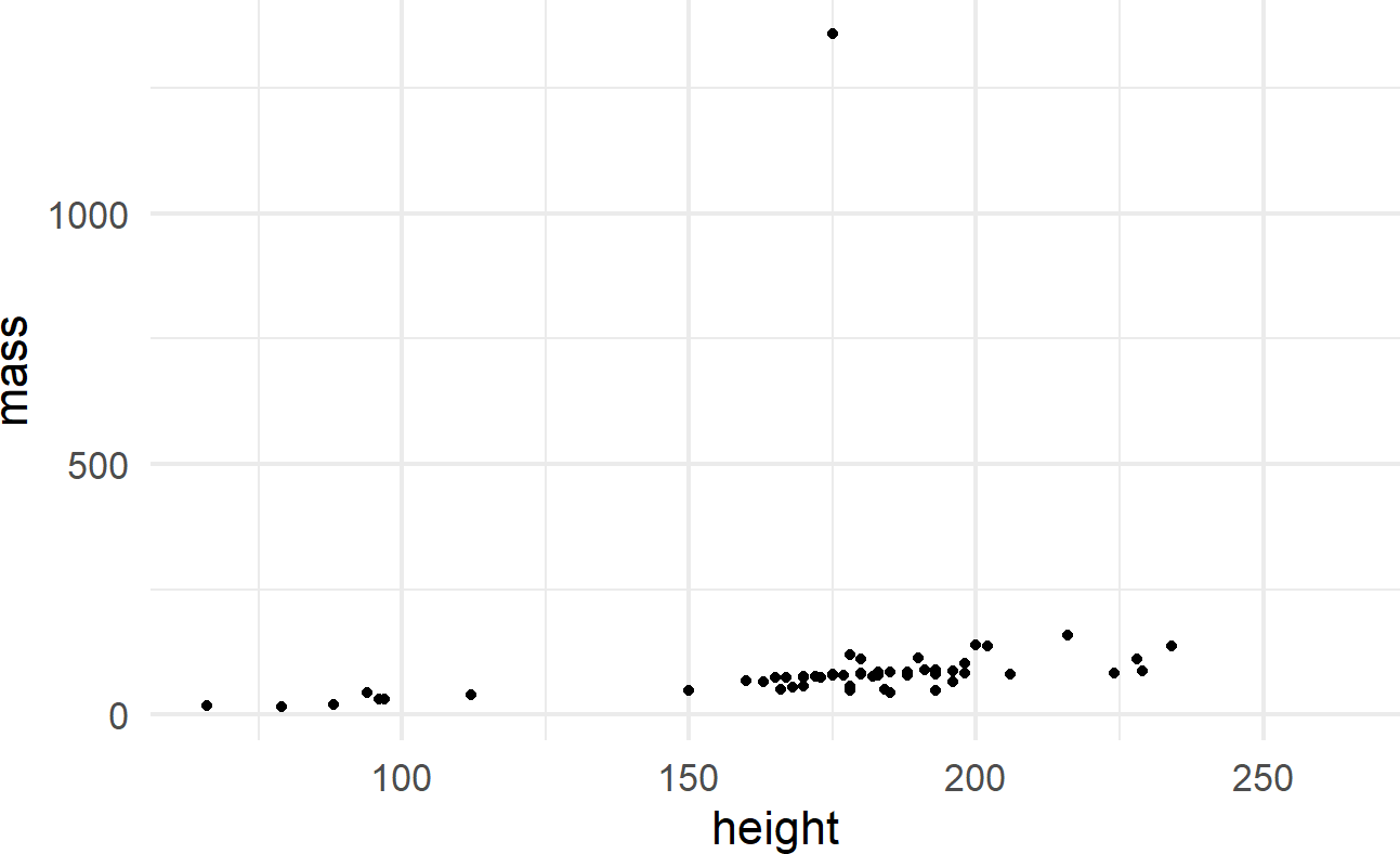
The initial ggplot() function call initiates the creation of a plot using a given dataset. The geom_point() function adds a layer of visual markings, i.e. point geoms, to the plot where:
- each point represents one row of the
starwarsdataframe, - the x-position of each point is determined by the value of the
heightvariable, - the y-position of each point is determined by the value of the
massvariable, and - intelligent defaults are set for every other decision required to make the corresponding plot.
See https://ggplot2.tidyverse.org/reference/#section-layer-geoms for complete list of available geometric objects.
8.2.2 Simple Plot Variations
Add another aesthetic mapping for a useful variation. To discover more aesthetics that can be controlled when using geom_point(), use ?geom_point to open the Help pane in the lower-right of RStudio. Scrolling down, you will discover the aesthetics shown in Figure 8.6 can be controlled when using this layer.
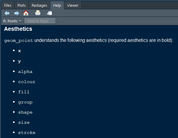 Figure 8.6: Aesthetics that can be controlled when using geom_point().
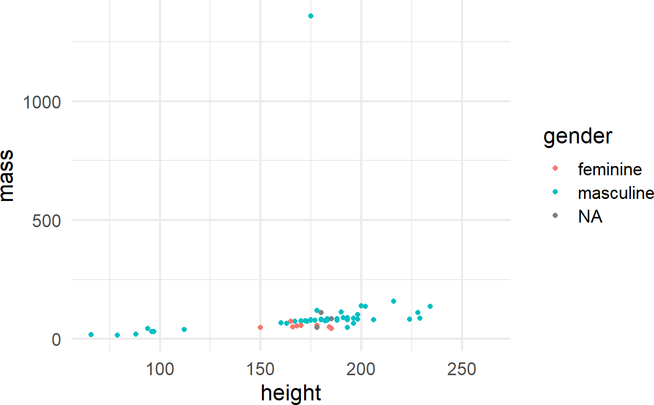
One way to control an aesthetic is to map it to the data by specifying the mapping within the aes() function call (Figure 8.7).
Figure 8.7: Using the aes() function.
The other way is to map the aesthetic to a constant outside of the aes() function, but within the geom function, like shown in Figure 8.8.
ggplot(data = starwars) +
  geom_point(mapping =
               aes(x = height, y = mass),
             shape = 15, color = "red")
Figure 8.8: The aes() function can also be placed within a geom function.
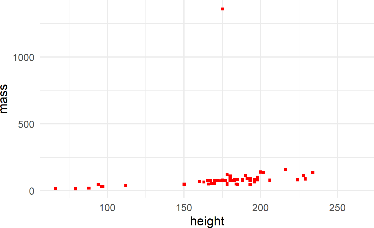
where color and shape are specified outside of the aes() function because they are mapped to constant values and not a column of the dataframe.
For more information on what shapes and colors are available, execute
the following R function vignette(
to open up details in the "ggplot2-specs")Help pane of RStudio.
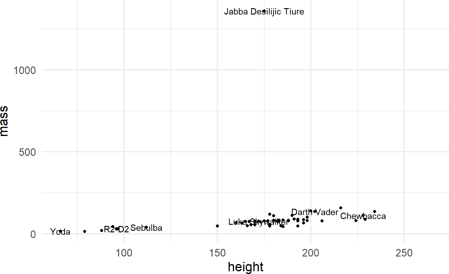
Multiple layers of geoms can be put on one plot. For example, we might want to name the points (Figure 8.9):
ggplot(data = starwars) +
  geom_point(mapping = aes(x = height, y = mass)) +
  geom_text(mapping =
              aes(x = height, y = mass, label = name),
            check_overlap = TRUE)
Figure 8.9: Adding labels to points in a ggplot() call.
To make the function call more concise, we can avoid the redundancy of mapping x-y positions for every geom by specifying mapping defaults in the initial ggplot() function. Any geom layers will use these defaults unless overridden with an aes() call from within that geom. Additionally, we can omit the data and mapping argument names by specifying those argument values in the order that the function expects. This yields the same plot with a little less typing (Figure 8.10):
Using check_overlap = TRUE omits data labels that would
otherwise overwrite and obscure a previously drawn data label.
Experiment leaving this argument out of the geom_text()
function to see the ugliness that happens when every label is
printed.
ggplot(starwars, aes(x = height, y = mass)) +
  geom_point() +
  geom_text(aes(label = name), check_overlap = TRUE)
Figure 8.10: When comfortable, argument names can be dropped for concision.

8.2.3 Other Geoms
We will see a few more geom’s throughout the book, most prominently featured will be geom_col(), geom_density(), geom_histogram(), and geom_linerange(). Each of these has a minimum set of aesthetic mappings which must be specified in order to produce a plot:
geom |
Required Aesthetics | Notes |
|---|---|---|
geom_col() |
x,y |
Map x to a discrete variable and y to a continuous variable |
geom_density() |
x |
Map x to a continuous variable |
geom_histogram() |
x |
Map x to a contiunuous variable and bin similar x values together |
geom_linerange() |
x,ymin,ymax |
Map x to a discrete variable and ymin,ymax to two related continuous variables |
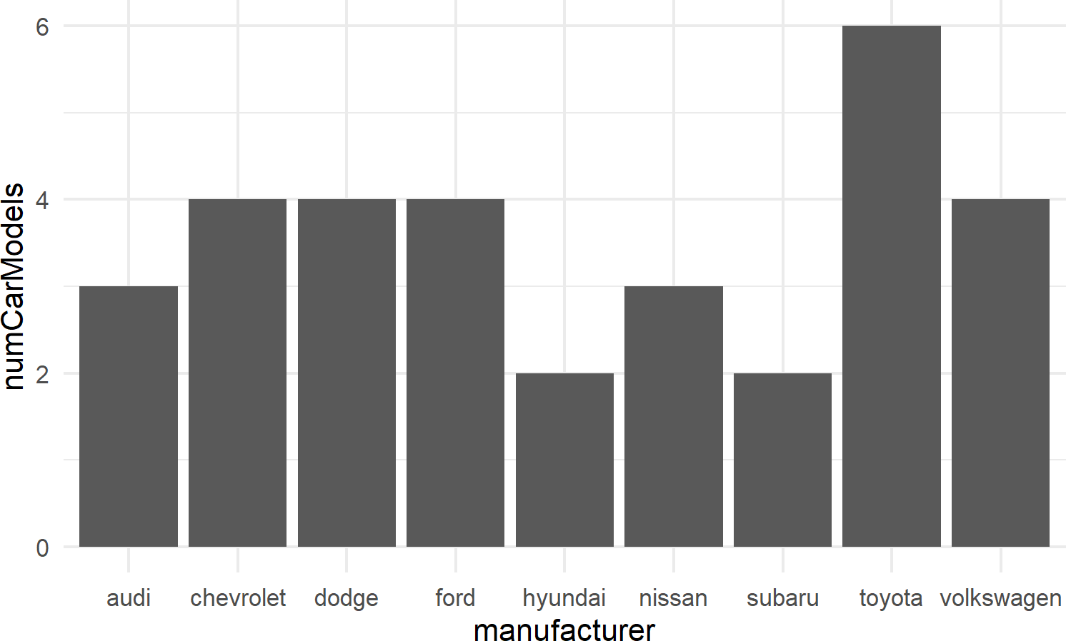
To show small examples of these other plot types, the following subset of data from the built-in mpg dataset will be used:
## create mpgDF data frame
mpgDF = mpg %>%
  group_by(manufacturer) %>%
  summarize(cityMPG = mean(cty),
            hwyMPG = mean(hwy),
            numCarModels = n_distinct(model),
            ) %>%
  filter(numCarModels >= 2)

mpgDF ## view contents of data frame
## # A tibble: 9 × 4
## manufacturer cityMPG hwyMPG numCarModels
## <chr> <dbl> <dbl> <int>
## 1 audi 17.6 26.4 3
## 2 chevrolet 15 21.9 4
## 3 dodge 13.1 17.9 4
## 4 ford 14 19.4 4
## 5 hyundai 18.6 26.9 2
## 6 nissan 18.1 24.6 3
## 7 subaru 19.3 25.6 2
## 8 toyota 18.5 24.9 6
## 9 volkswagen 20.9 29.2 4Small examples are shown below to expose the reader to these capabilities.
8.2.3.1 geom_col()
For bar charts R has both geom_bar() and geom_col(). geom_bar(), not shown here, makes the height of the bar proportional to the number of cases in each group; we use this less frequently. More often, we want the heights of the bars to represent values in the data and this is why we typically use geom_col() as the workhorse for bar chart creation (see example of Figure 8.11).
Recall from the dplyr chapter that the chaining
operator, %>% makes the object to its left the first
argument of the function to its right. Since the first argument to the
ggplot function is assumed to be the data argument (see https://ggplot2.tidyverse.org/reference/ggplot.html),
mpgDF %>% ggplot() passes the mpgDF data
frame as the data argument value used in the
ggplot() function; ggplot(mpgDF) and
ggplot(data = mpgDF) are other equivalent ways call the
function.
mpgDF %>% ## use mpgDF as data argument to ggplot()
 ggplot() +
 geom_col(aes(x = manufacturer, y = numCarModels))
Figure 8.11: A typical bar chart uses the column geom, not the bar geom.
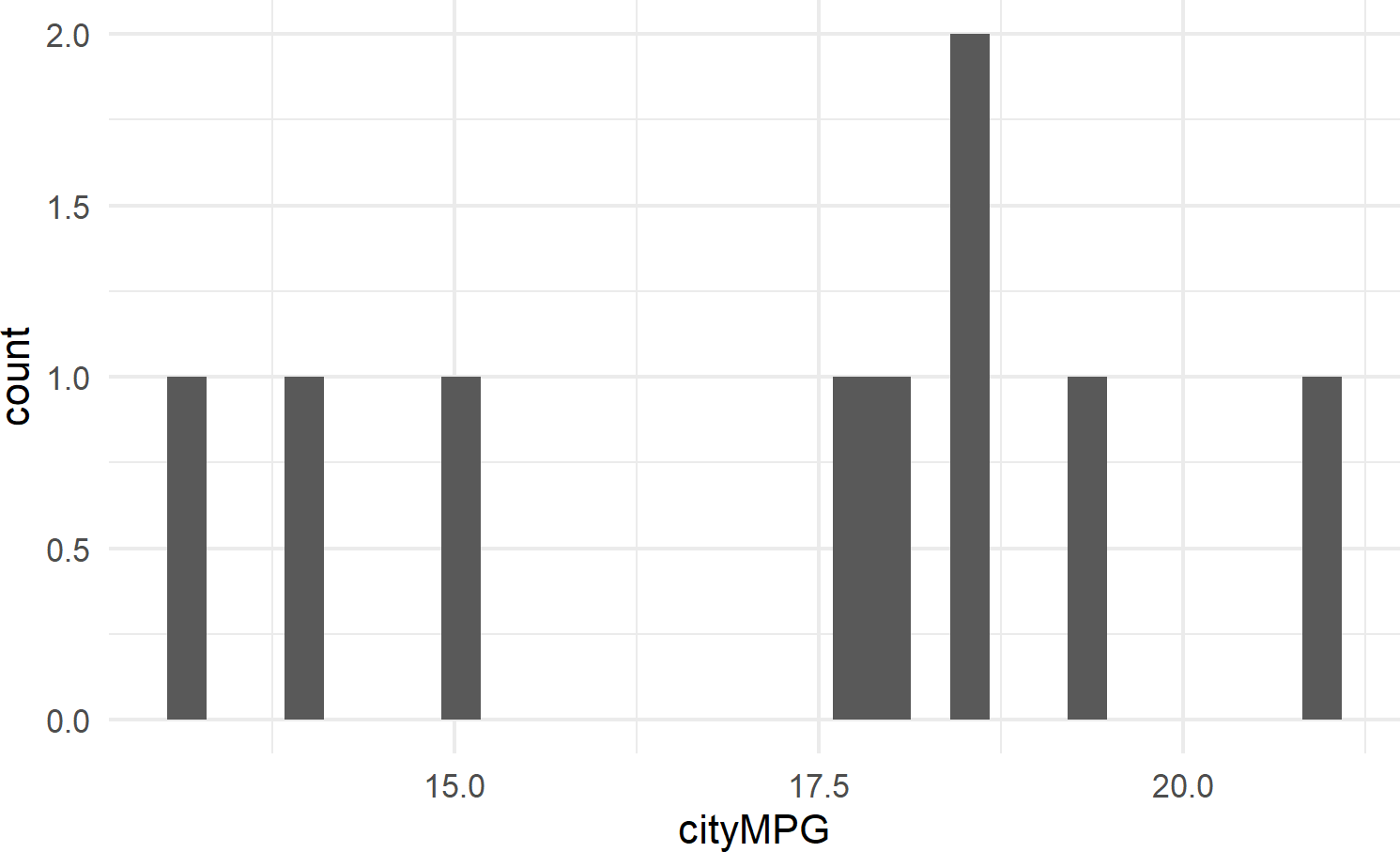
8.2.3.2 geom_histogram
Figure 8.12 shows an example of geom_histogram; a tool for visualizing the distribution of a single continuous variable. It achieves this by dividing the x-axis into bins, each containing a range of data values, and then tallying the number of observations within each bin. These counts are then represented on the y-axis of the plot, where the bar heights reflect the respective counts. In essence, histograms offer a straightforward way to grasp how data is distributed across different value ranges.
Figure 8.12: Example showing geom histogram.
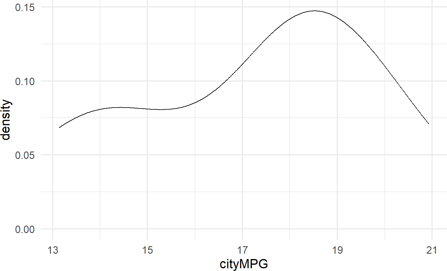
8.2.3.3 geom_density
geom_density() calculates a smoothed representation of a histogram (see Figure 8.13), which is a graphical way to display the distribution – or the spread and arrangement – of continuous data. Visualizing the data distribution shows different values of the data on the x-axis with relative frequency of those values represented by height of the markings on the y-axis.
See https://serialmentor.com/dataviz/histograms-density-plots.html for more information on both density plots and histograms.
Figure 8.13: Example showing geom density.
8.2.3.4 geom_linerange
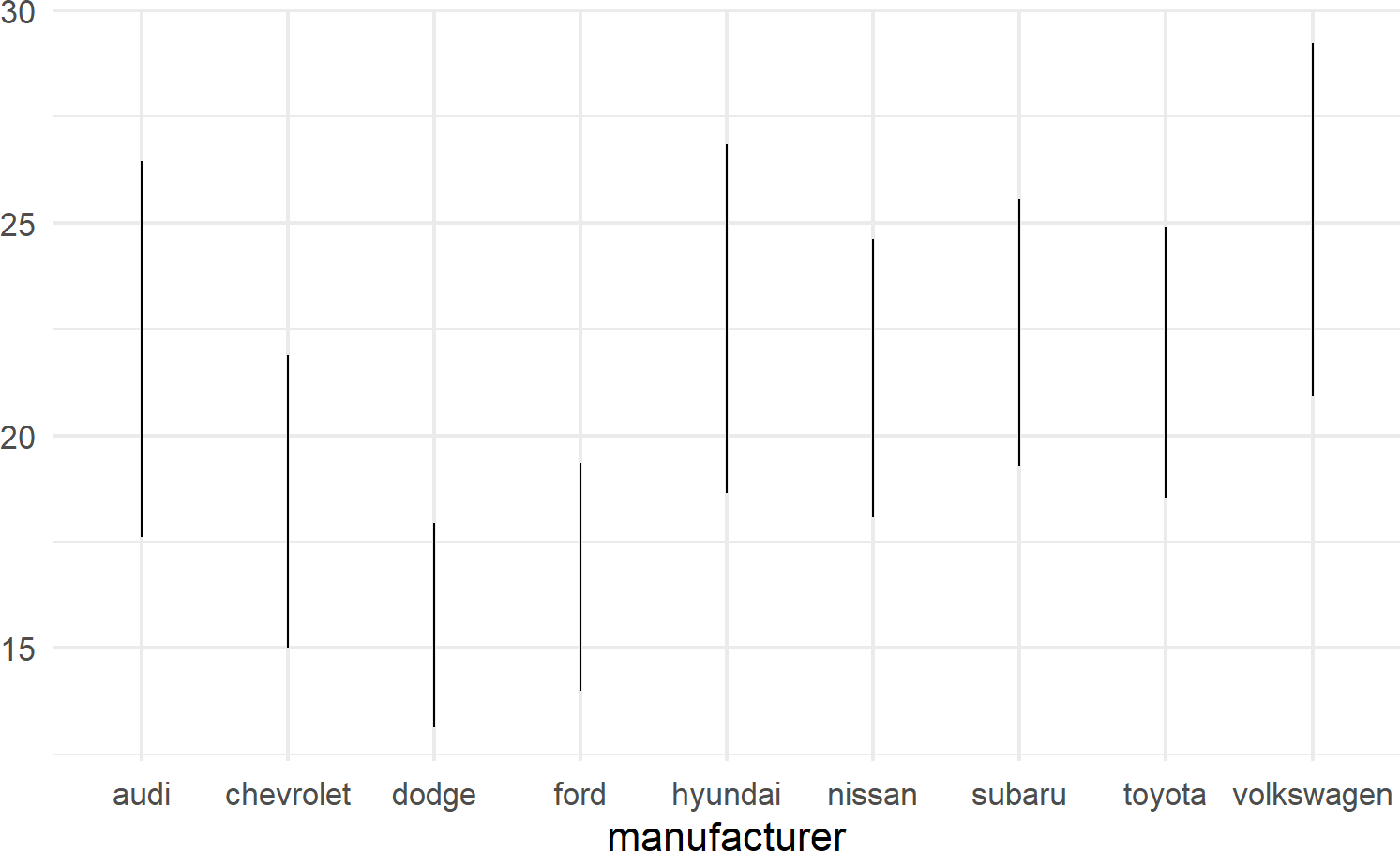
geom_linerange is used to create a line segment that represents a range of data or possible data values; useful for visualizing intervals, uncertainties, or potential outcomes within your data. By displaying a line segment with distinct start and end points, geom_linerange() enables you to effectively communicate the variability or potential scenarios associated with your data. For example, Figure 8.14 shows a range of potential fuel economies for each vehichle in the mtcars dataset.
mpgDF %>% ## use mpgDF as data argument to ggplot()
  ggplot() +
  geom_linerange(aes(x = manufacturer,
                     ymin = cityMPG,
                     ymax = hwyMPG))
Figure 8.14: An example showing geom linerange.
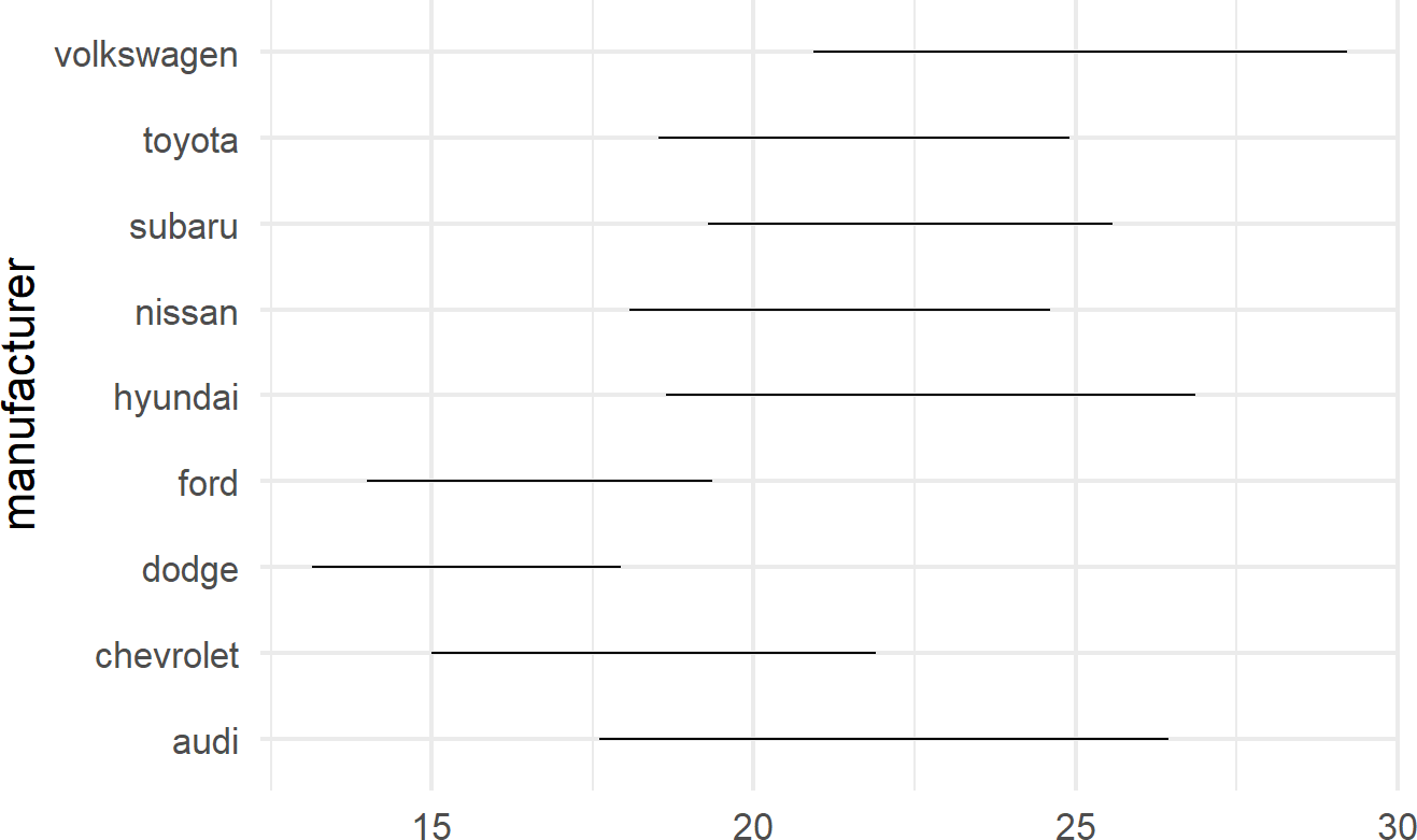
A useful trick to know when using geom_linerange() is to flip the axes when mapping a position aesthetic to long labels such as car manufacturer names as shown in Figure 8.15.
mpgDF %>% ## use mpgDF as data argument to ggplot()
  ggplot() + #change aesthetics to y, xmin, xmax
  geom_linerange(aes(y = manufacturer,
                     xmin = cityMPG,
                     xmax = hwyMPG))
Figure 8.15: Place long labels on the y-axis for easier legibility.
8.2.4 Other Elements of the Grammar
Above, we learned that specifying a complete plot requires a dataset, a geom, and a minimal set of mappings. Behind the scenes, other grammatical elements were chosen by default; in reality, you can make all of these other decisions explicit. Some of these other grammatical elements include a coordinate system, a statistical transformation, and scales:
- Coordinate Systems A coordinate system (coord for short) determines how data coordinates are mapped to the plane of a graphic. The default coordinate system is a two-axis system, think x- and y-coordinates, called the cartesian coordinate system. We will use this exclusivley.
- Statistical Transformations: A statistical transformation is a way of manipulating or transforming data prior to its display. It usually is used to summarize data in a meaningful way such as when creating a histogram of one variable or summarizing the relationship of two variables using a linear regression line. These transformations are optional, but can prove useful as shortcuts to get from data to useful visuals.
- Scales: Whereas aesthetic mappings relate data to attributes that you can visually perceive (e.g. color, symbol shapes, fill, etc.), scales dictate how the mapping from data to attribute is performed. For example, a scale might determine which colors are mapped to which values in the data.
We will learn more about these other elements on an as needed basis. For now, we recognize the grammar for what it is, namely a strong foundation for understanding and describing a wide range of graphics.
8.3 Exercises
The penguins dataset is a fun dataset made available in R by Horst, Hill, and Gorman (2020Horst, Allison Marie, Alison Presmanes Hill, and Kristen B Gorman. 2020. Palmerpenguins: Palmer Archipelago (Antarctica) Penguin Data. https://doi.org/10.5281/zenodo.3960218.). Use the below script to get penguinsDF which is needed for these exercises.
# uncomment below line to install dataset
# install.packages("palmerpenguins")
library(palmerpenguins)
library(tidyverse)
penguinsDF = penguins

penguinsDF %>% ## see a basic plot
  ggplot() +
  geom_point(aes(x = flipper_length_mm,
                 y = body_mass_g))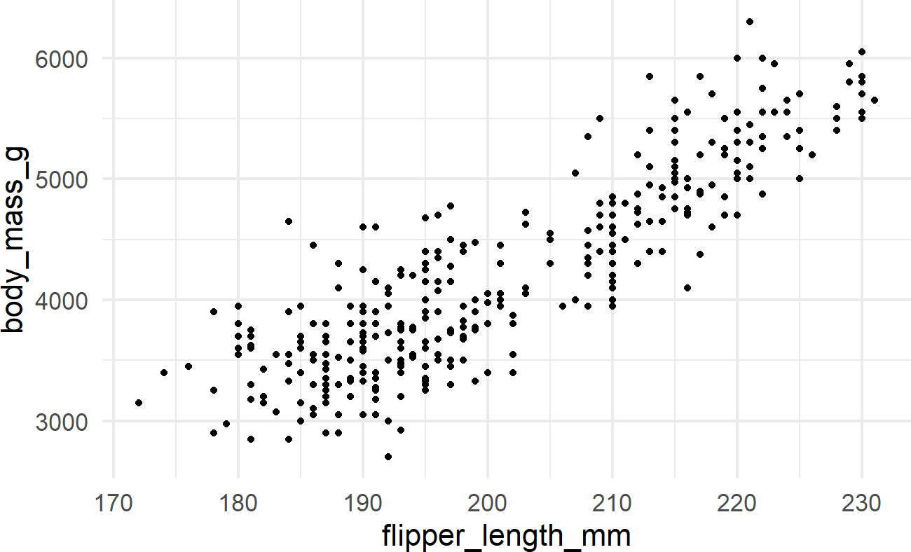
Exercise 8.1 Using the above instructions, create a dataframe of average body mass by species. Feed that dataframe to ggplot and use geom_col() to create a bar chart of average body mass by species.
Exercise 8.2 Continuing the previous exercise, modify the below code so that the color of the points is mapped to the species column in the dataframe.
penguinsDF %>%
  ggplot(aes(x = flipper_length_mm,
             y = bill_length_mm)) +
  geom_point(size = 3,
             alpha = 0.8) +
  labs(title = "Flipper and bill length",
       subtitle = "Palmer Station Penguin Dimensions",
       x = "Flipper length (mm)",
       y = "Bill length (mm)",
       color = "Penguin species",
       shape = "Penguin species") +
  theme_minimal(16)
Exercise 8.3 Modify the above code so that the color AND shape of the points are both mapped to the species column in the dataframe.