Chapter 9 ggplot2: The Four Stages of Visualization
The aim of the grammar of graphics is to provide an efficient language for describing visualizations. Using this grammar, however, is no guarantee that a visual will prove to be compelling. The next question is to determine how to apply the grammar to a real problem - what data, mappings, and geoms have the highest potential of revealing the stories locked inside of data frames?
To ensure both the exploratory and persuasive powers of visualizing data, a four-stage workflow is recommended. The four stages in the visualization workflow are:
- Purpose - determine the purpose of the visualization.
- Content - create or obtain the data that has potential to aid the purpose articulated in stage 1.
- Structure - map data to visual aesthetics and select geoms that are most likely to reveal underlying patterns and insights.
- Formatting - polish and format the best visual(s) from stage 3 so that they are more informative and/or persuasive for your intended audience; make the visuals look professionally done as required.
9.1 A Fully Worked Example of The Four Stages
By way of example, we work through three of the four stages of data visualization. The first stage, purpose, is defined for you to set the context for our example. The content, structure, and formatting will be decided as we go through the example. Read the following background about baseball in Colorado’s Coors Field:
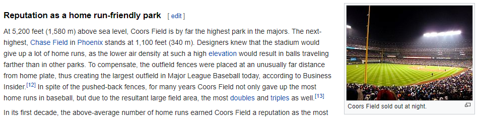
Figure 9.1: Coors Field baseball stadium has a reputation as a park that is friendly to batters. http://en.wikipedia.org/wiki/Coors_Field
The purpose of our data visualization is 1) to confirm the Coors field reputation that it is the easiest baseball stadium for teams to score runs at, and 2) if true, create a visual that informs its audience that Coors Field is the easiest baseball stadium to score runs at - note, the purpose of the visual should be obvious to all who encounter it.
9.1.1 Stage 1: Purpose
Coors Field (Figure 9.1) has a reputation for being friendly to batters - particularly for teams to score runs easily. Our purpose is to form a data-driven opinion about the validity of this statement and create a persuasive visualization to support our opinion.
9.1.2 Stage 2: Content
To match our purpose, we need information about average runs scored per game at all baseball stadiums. And probably not just one game at each stadium, rather, we want a bunch of data from each stadium - say at least 100 games from each stadium. We can then compare Coors Field (three-letter code: COL) to all others. Luckily, the causact package has some data that seems relevant:
# the following line loads data from the 2010 - 2014
# baseball seasons.  The following data gets loaded:
# Date:   The date the baseball game was played
# Home:   A three letter code for the "home" team
# Visitor:A three letter code for the "visiting" team
# HomeScore:     # of runs scored by the home team
# VisitorScore:  # of runs scored by the visiting team

library(causact) ## get dataset
library(tidyverse)  ## loads dplyr and ggplot2

baseballDF = baseballData %>% as_tibble()
baseballDF
## # A tibble: 12,145 × 5
## Date Home Visitor HomeScore VisitorScore
## <int> <fct> <fct> <int> <int>
## 1 20100405 ANA MIN 6 3
## 2 20100405 CHA CLE 6 0
## 3 20100405 KCA DET 4 8
## 4 20100405 OAK SEA 3 5
## 5 20100405 TEX TOR 5 4
## 6 20100405 ARI SDN 6 3
## 7 20100405 ATL CHN 16 5
## 8 20100405 CIN SLN 6 11
## 9 20100405 HOU SFN 2 5
## 10 20100405 MIL COL 3 5
## # ℹ 12,135 more rowsWe will now switch to using library(tidyverse) instead
of library(ggplot2) or library(dplyr) - it
loads both of them with one command.
WOW!! There are 12,145 observations of baseball games spread over 30 teams. This should be about 400 observations per stadium - that will work. We just need to get average total runs by stadium:
baseballData2 = baseballDF %>%
  mutate(totalRuns = HomeScore + VisitorScore) %>%
  group_by(Home) %>%
  summarise(avgRuns = mean(totalRuns)) %>%
  arrange(desc(avgRuns))

baseballData2
## # A tibble: 31 × 2
## Home avgRuns
## <fct> <dbl>
## 1 COL 11.1
## 2 BOS 9.76
## 3 TEX 9.58
## 4 TOR 9.42
## 5 DET 9.19
## 6 ARI 9.18
## 7 NYA 9.13
## 8 MIN 9.09
## 9 BAL 9.03
## 10 MIL 8.98
## # ℹ 21 more rowsViewing the data, it seems obvious that we have the content we need. Let’s now structure the visualization using the most appropriate grammatical mappings.
WARNING: No matter how good a visualization might look aesthetically, if its content does not match the purpose of your analytic investigation, then it will be useless. For all visualizations, think of what matters.
9.1.3 Stage 3: Structure
Structure is our choice in how to display the content we have collected. This choice should reveal the most important data characteristics and the relationships we are analyzing. By choosing a meaningful geom and mapping of aesthetics to data, we can give our brains the best chance at perceiving meaningful patterns and insights.
To limit the scope of our options, let’s restrict ourselves to two geoms: geom_point() or geom_col() - often referred to as a scatterplot and a bar chart, respectively. These two seem to be the workhorses of my visualization efforts. In terms of aesthetic mappings, two main characteristics of the data determine the likely suitability of any aesthetic. The two are :
- Ordinality: Ordinal data, or ordered data, is data that can be sorted along a dimension. As examples, numerical data can be sorted along a number line, text labels can be sorted alphabetically, and some survey scales (e.g. “Mostly Agree”, “Slightly Agree”, “Neutral”,“Disagree”) can be sorted along a more qualitative dimension like agreeability or favorability. Visual encodings that reflect order include positioning, length, and size, but usually do not include color or shape where it is not obvious that green is better than yellow, or squares are larger than circles. Sometimes though, you can use color when the context is obvious - for example, green is often associated with a profit and red with a loss.
- Cardinality: Cardinality of a data column is the number of distinct data values in a column. This column indicates how many distinct values can be represented by the encoding. For example, humans can easily distinguish 10 carefully chosen colors from one another, but it is impossible to choose twenty colors where each is easily distinguished from all others. Hence, color is only a good encoding for data with only a handful of unique values (e.g. gender, responses to yes/no questions, car manufacturer, etc.). Position on the other hand could be a good encoding for real-valued numbers as very small changes in position are detectable by the human eye. In contrast, something like the angular change of a line could also represent a real-valued number, but cannot be used with alot of data as small changes in angle are hard to detect.
To see how to choose which aesthetics to map to different types of data, read through the below table specifying the ordinality and cardinality appropriate for each aesthetic:
aesthetic |
Handles Ordinal Data | Max. Cardinality | Notes |
|---|---|---|---|
x,y: x- or y-postion |
\(\checkmark\) | Infinite | Most powerful aesthetic. Use it for your most important data. Handles infinite data and small differences in data are easily detected by the human eye. |
color or fill for discrete data |
no | < 12 | Use color to map data to the color of points or the color of bar outlines - use fill to map data to the color of the actual bar. This is another powerful aesthetic to use - you just need a data column of unordered data with not too many distinct values, i.e. categorical data. Each distinct value will be assigned a color automatically (e.g. value1 will be “red” and value2 to will be “blue”). |
color or fill for continuous data |
\(\checkmark\) | depends | Similar to above excepts mappings of values to colors will change the hue, not the actual color. So numerical data might have small numbers mapped to a dark blue color and large numbers mapped to a lighter shade of blue. |
alpha (i.e. transparency) |
\(\checkmark\) | a few | Use alpha to map transparency of points to numerical data. Less important points/bars can be made more transparent. This aesthetic is often better mapped to a constant. Useful for overplotting lots of points on top of one another. |
shape |
no | <12 | Use shape to map a few different categorical (unordered) values to different point types, i.e. circles, squares, triangles, etc. |
size |
\(\checkmark\) | <12 | Use size to map data values to the size of the points or bars. Since small differences in size, say of a circular point, are not easily detectable by the human eye, use this aesthetic when you seek to reveal only large differences in your numerical data. |
Given that we have only two columns of data in our example baseball dataset, we can assess their ordinality and cardinality to see which aesthetics are even appropriate:
data column |
Ordinal? | Cardinality | Useful Aesthetics |
|---|---|---|---|
Home: stadium name |
no | 31 | x,y |
avgRuns: avg runs scored per game |
\(\checkmark\) | 31 | x,y,color,fill |
baseballData2 %>% select(Home) %>% distinct() and
baseballData2 %>% select(avgRuns) %>% distinct() will
help you determine the cardinality of Home and
avgRuns. Simply look at the number of rows in the output
and that is the cardinality of the selected data column.
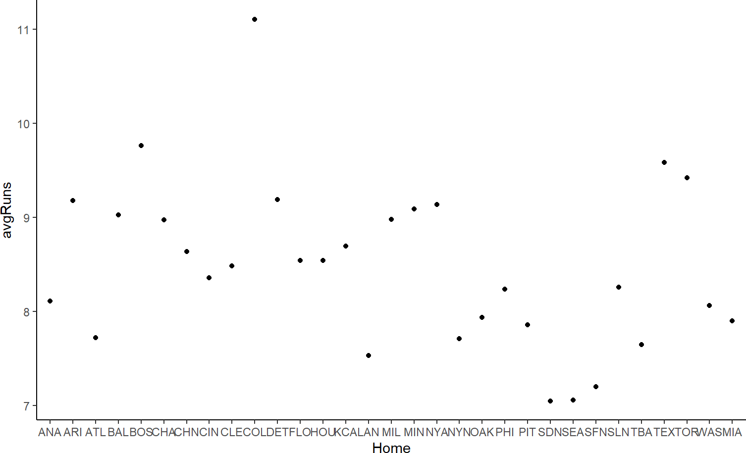
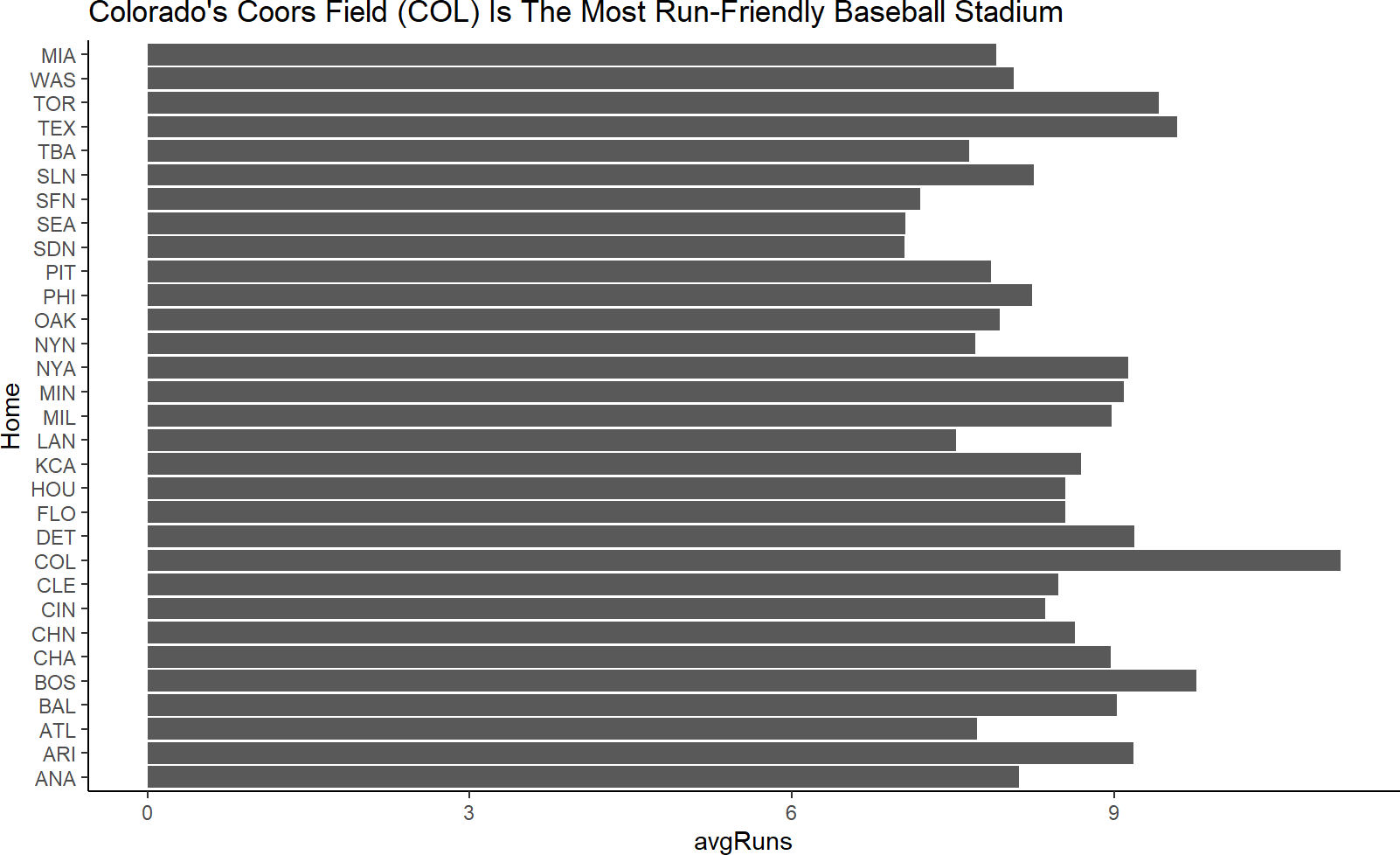
From the above table, we see that only the x- or y-axis is good for stadium name. Let’s suggest the x-axis and see how it works. For ‘avgRuns’ we saw more relevant aesthetics, but since y is not used and x/y-position is the most powerful aesthetic in visualization, we will map avgRuns to the y-axis. In terms of geoms, I am somewhat indifferent between points and bars, let’s try both. Points are shown in Figure 9.2.
Figure 9.2: Using points as the geom.
And bars can be seen in Figure 9.3.
Figure 9.3: Using columns as the geom.
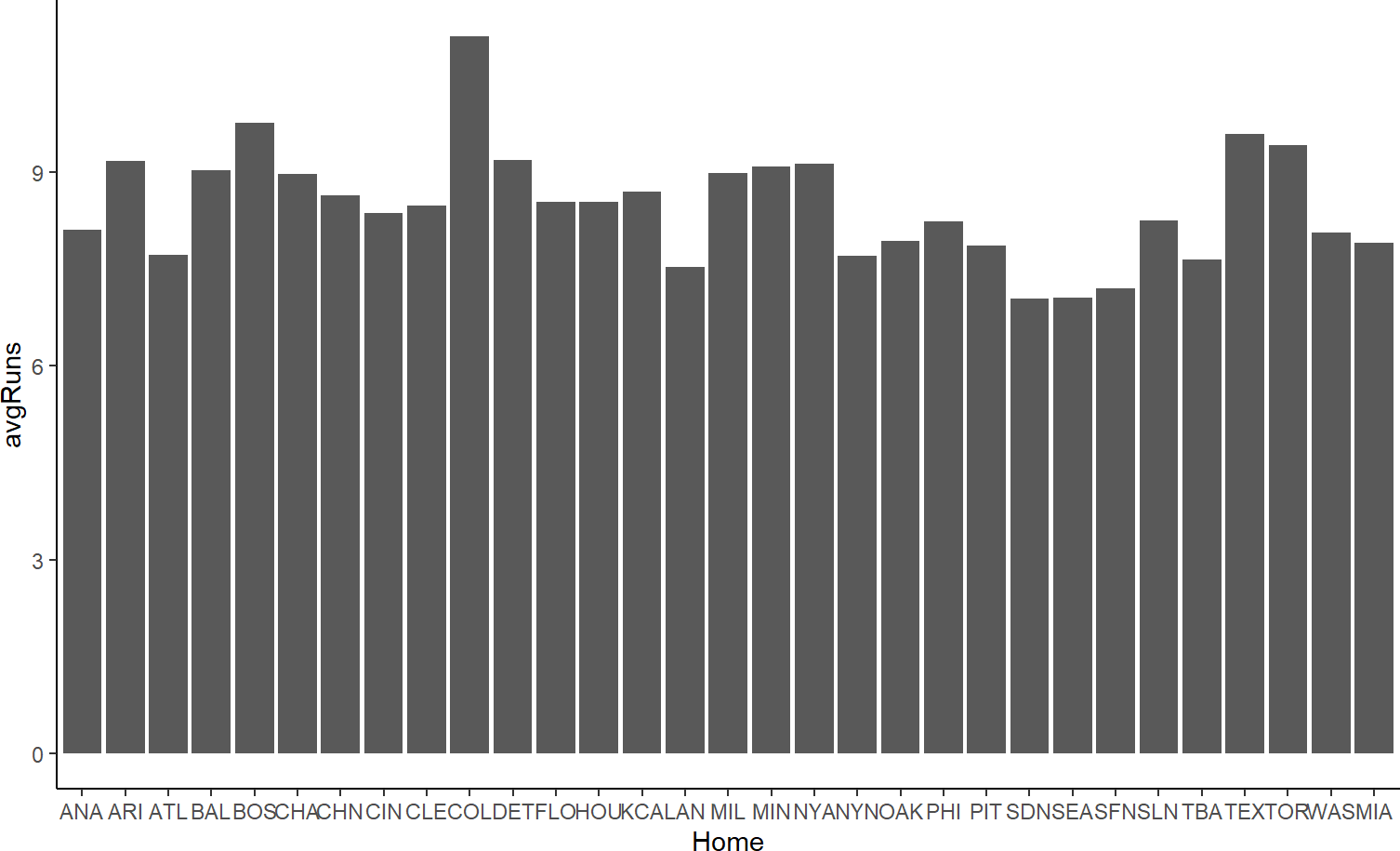
Figure 9.3 feels mildly better to Figure 9.2, the bar height helps trace the connection of each data value to its x-axis value.
As is often the case with using geom_col() I will recommend flipping the axes when the x-axis labels look crowded. Figure 9.4 is a preferred result to my eye:
Figure 9.4: Using columns as the geom and flipping the axes.
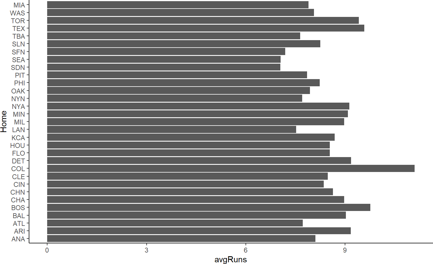
If you were only trying to convince yourself that Coors Field is truly the most run-friendly baseball stadium, I recommend stopping here. However, if you need to convince others, then the plot’s purpose and result should be made easier for an audience to digest. That is the goal of formatting.
9.1.4 Stage 4: Formatting
The last stage of data visualization is formatting. In exploratory data analysis, the work on this step should be minimal. However, once you go beyond exploration and your visualization is to be shared, then you should spend considerable time formatting your work to be persuasive. There is always a little productive struggle required to get things perfect, so bring your patience and perseverance to this step.
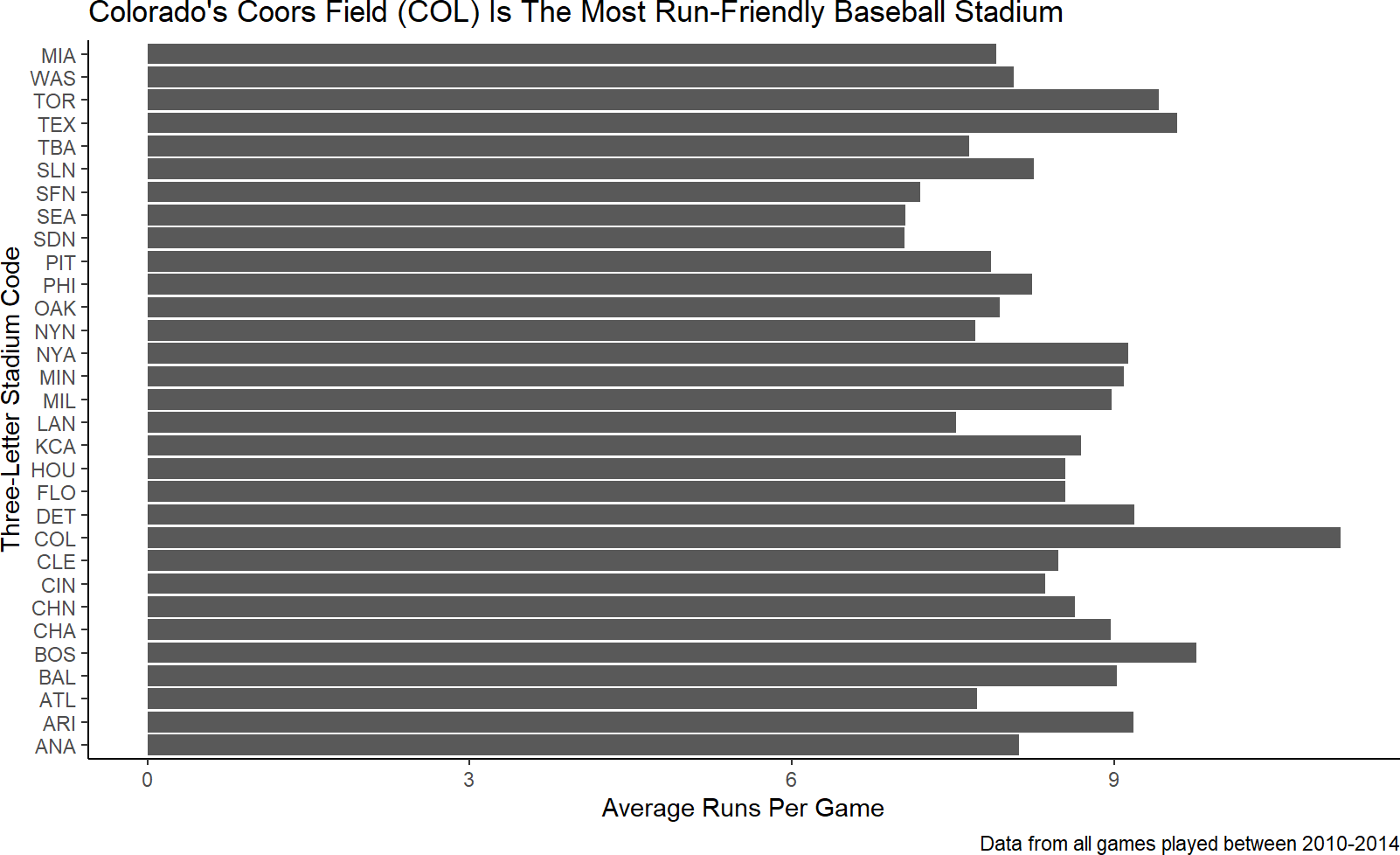
The easiest fix to ensure your audience gets the message of your visualization is to add a title. The title should be the message, not just a description of the plot:
baseballData2 %>%
  ggplot(aes(y = Home, x = avgRuns)) +
  geom_col() +
  labs(title = "Colorado's Coors Field (COL) Is The Most Run-Friendly Baseball Stadium")
Figure 9.5: Add the purpose from stage 1 as your title.
Notice, the code to create Figure 9.5 added a labels layer (i.e. using the + sign and labs function). In addition to title, the arguments of the labs function include x for the x-axis label, y for the y-axis label, subtitle and caption. Let’s take the time now to at least make our axis labels more meaningful to an external audience and use the caption capability to communicate our data source:
baseballData2 %>%
ggplot(aes(y = Home, x = avgRuns)) +
geom_col() +
labs(title =
"Colorado's Coors Field (COL) Is The Most Run-Friendly Baseball Stadium",
y = "Three-Letter Stadium Code",
x = "Average Runs Per Game",
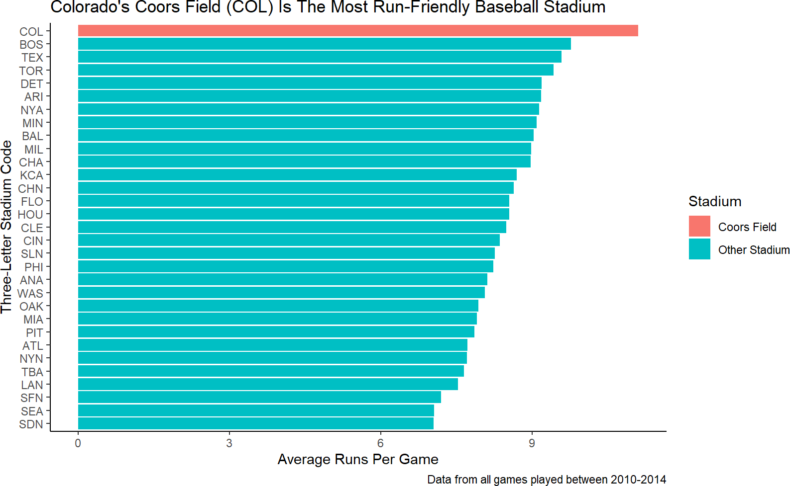
caption = "Data from all games played between 2010-2014")Figure 9.6: Add meaningul axis labels and a caption of the data source information.
For the next iteration of formatting, ask yourself how can I accelerate the rate at which my external audience can confirm the plot’s title/purpose from the visual. To do this, I need the audience to be able to 1) find Coors Field on the plot and 2) quickly assess that Coors Field is truly the most run-friendly.
Finding Coors Field can be made easier by highlighting it. Of all the remaining aesthetics we can choose from to use, fill is going to be the most powerful. A quick attempt to use fill to distinguish among stadiums might look like this:
baseballData2 %>%
  ggplot(aes(y = Home, x = avgRuns)) +
  geom_col(aes(fill = Home)) +
  labs(title = "Colorado's Coors Field (COL) Is The Most Run-Friendly Baseball Stadium",
       y = "Three-Letter Stadium Code",
       x = "Average Runs Per Game",
       caption = "Data from all games played between 2010-2014")
Figure 9.7: A hasty attempt at helping direct the audience to find Coors Field more easily. This is a terrible plot because color is not a good aesthetic for 31 unique elements (i.e. stadiums).
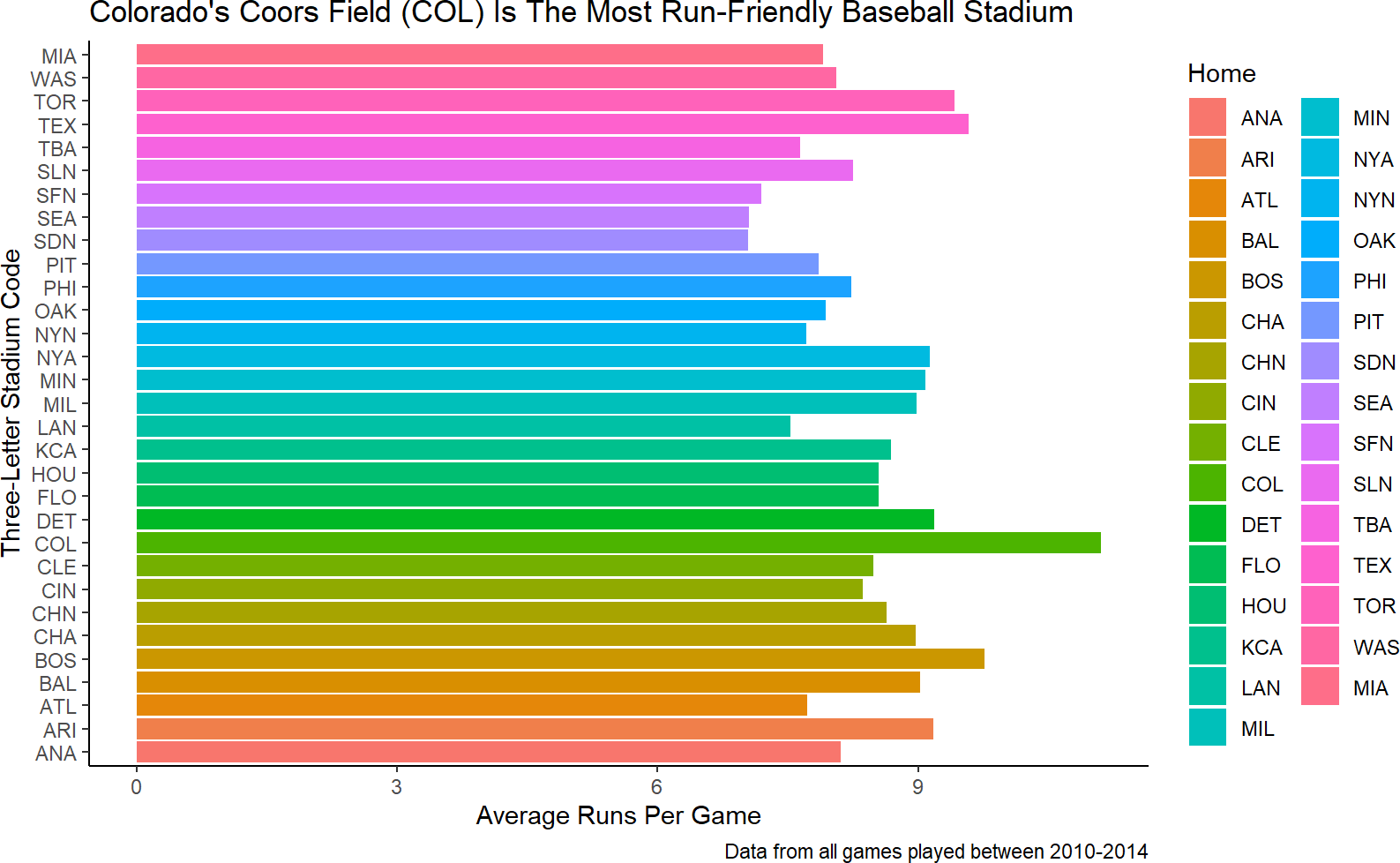
While your instincts might be to say how do I change the
fill aesthetic for the bars to highlight Coors Field, you
must resist those instincts and ask “do I have a column of data that I
can map to the fill aesthetic which distinguishes Coors Field from all
others?”
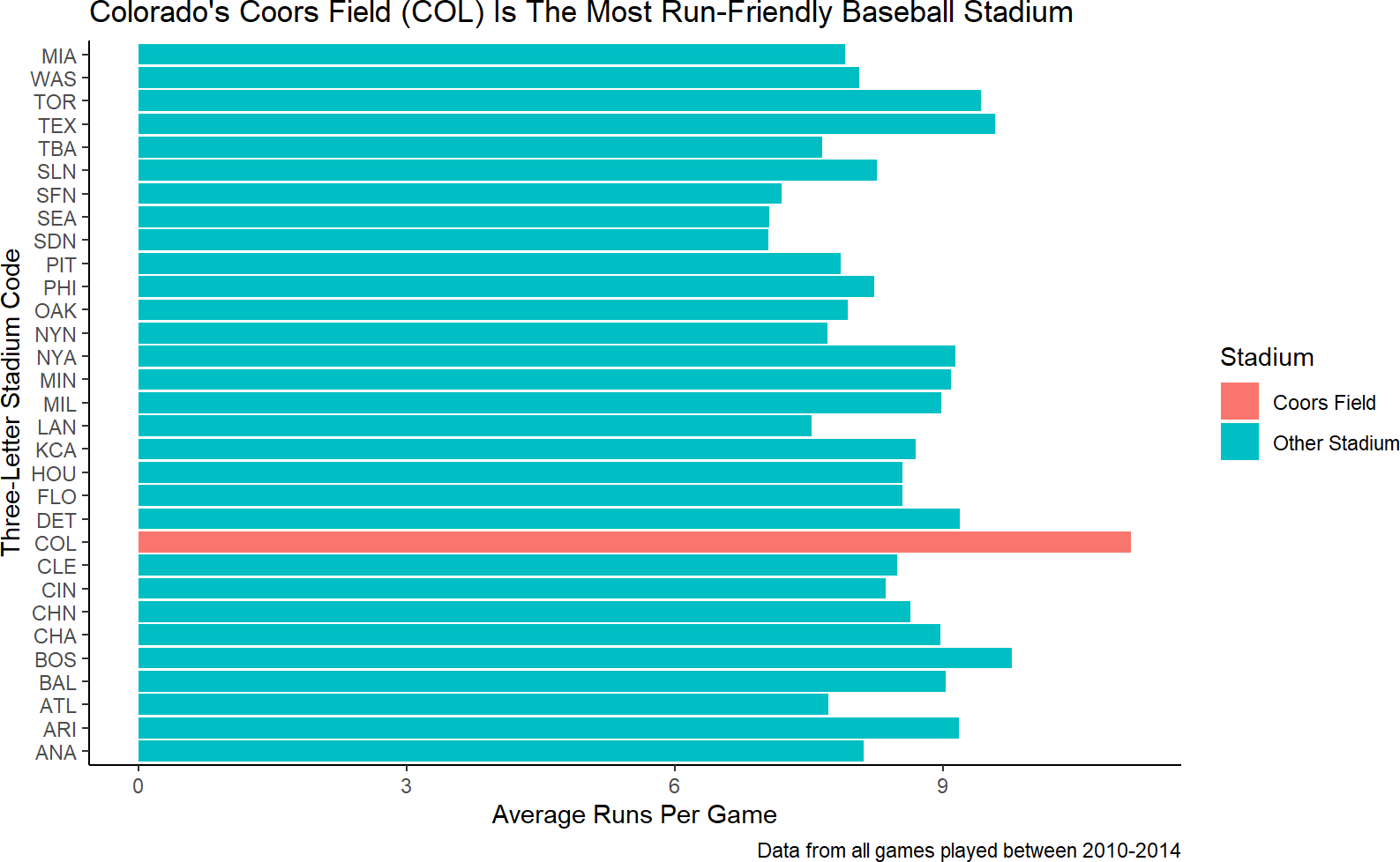
Figure 9.7 is unsatisfying and shows the danger of mapping a higher cardinality data column to color. We really just want Coors Field to be highlighted. This means we need another column of data. In fact, we need an indicator function (recall from dplyr chapters) that supplies the data which answers this question, and then, we can map that data to the fill aesthetic.
The indicator can be created with mutate and we will call the new dataframe plotDF for lack of creative naming capabilities and to communicate this data column is for plotting purposes:
and now we can change the data argument and the fill aesthetic of the previous plot to map to our new column:
plotDF %>%
  ggplot(aes(y = Home, x = avgRuns)) +
  geom_col(aes(fill = Stadium)) +
  labs(title = "Colorado's Coors Field (COL) Is The Most Run-Friendly Baseball Stadium",
       y = "Three-Letter Stadium Code",
       x = "Average Runs Per Game",
       caption = "Data from all games played between 2010-2014")
Figure 9.8: Mapping the fill aesthetic to an indicator function of whether the stadium is Coors Field or not.
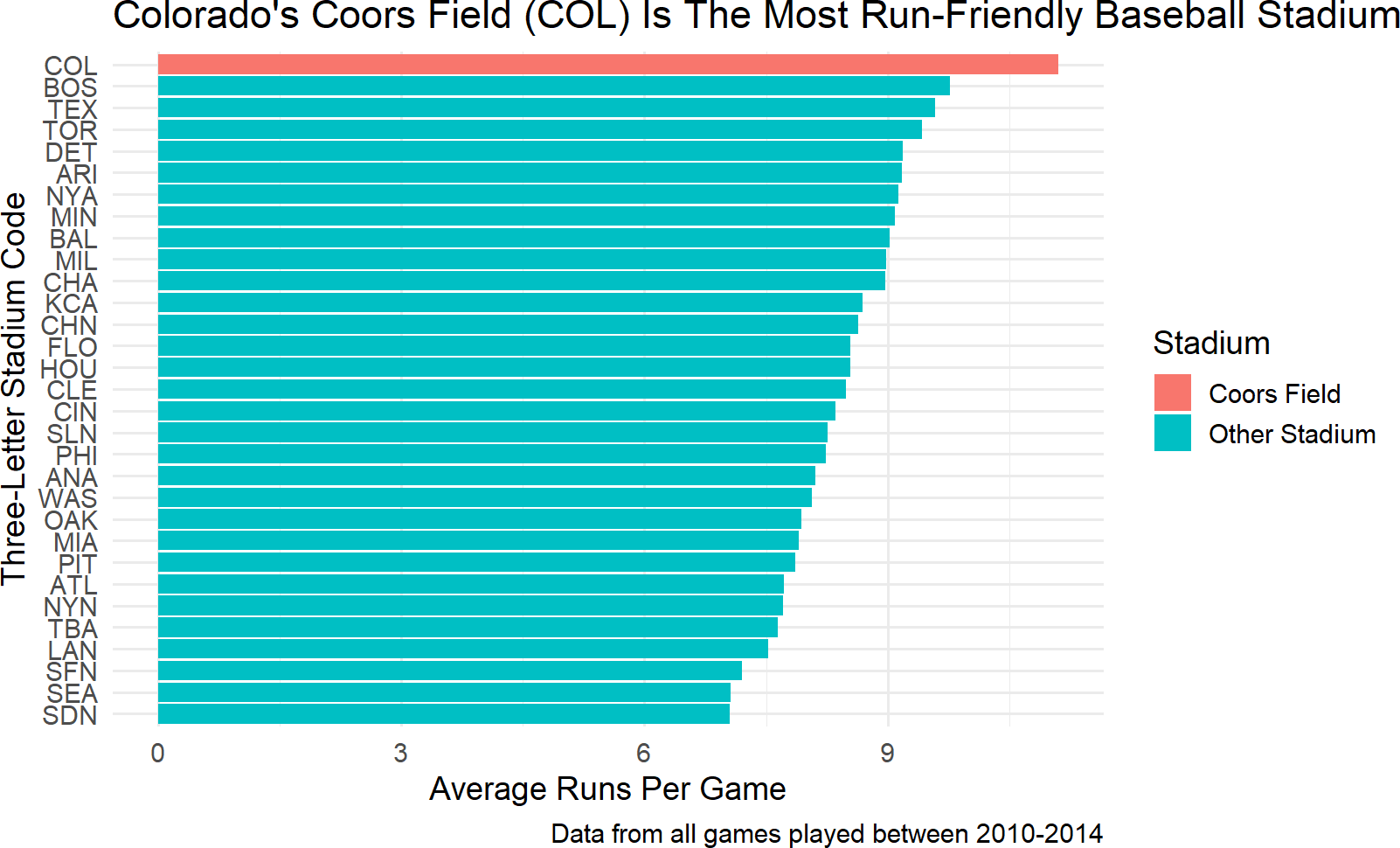
Accelerating an external audience’s assessment of Coors Field as the most run-friendly stadium is the last bit of formatting we will tackle here. Looking at the data mapped to the vertical axis of Figure 9.8, we see the order/positioning of the stadiums is arbirtrary - it seems sort of alphabetical. Let’s try to use position order of the stadiums to reflect run-friendiness.
Just how is position order determined? Well notice that stadium is particular type of object in R called a factor:
## [1] "factor"Factors are useful whenever data has a fixed and known set of possibilities, such as the fixed set of baseball stadiums. We can see the order of a factor using the levels() function:
##  [1] "ANA" "ARI" "ATL" "BAL" "BOS" "CHA" "CHN" "CIN" "CLE" "COL" "DET" "FLO"
## [13] "HOU" "KCA" "LAN" "MIL" "MIN" "NYA" "NYN" "OAK" "PHI" "PIT" "SDN" "SEA"
## [25] "SFN" "SLN" "TBA" "TEX" "TOR" "WAS" "MIA"See https://forcats.tidyverse.org/ for more information about working with factors using the forcasts package that is part of the tidyverse package group.
Notice the order matches that of the vertical axis (from bottom to top) in Figure 9.8. To reorder a factor by another variable, we can use the fct_reorder function which takes two arguments: 1) .f - the original factor and 2) .x - another variable to reorder the levels by. By default, the .x variable is sorted in ascending order. Using fct_reorder within a mutate function, we can overwrite the levels of plotDF$Home and then plot the data as shown in Figure 9.9.
library(tidyverse)  # to get fct_reorder function
formattedPlot = plotDF %>%  # save plot to object
  mutate(Home = fct_reorder(Home,avgRuns)) %>% ##NEW LINE
  ggplot(aes(y = Home, x = avgRuns)) +
  geom_col(aes(fill = Stadium)) +
  labs(title =
    "Colorado's Coors Field (COL) Is The Most Run-Friendly Baseball Stadium",
       y = "Three-Letter Stadium Code",
       x = "Average Runs Per Game",
       caption = "Data from all games played between 2010-2014")

formattedPlot # view ggplot object
Figure 9.9: Mapping the fill aesthetic to an indicator function of whether the stadium is Coors Field or not.
9.1.5 A Note on Scales and Themes
Often, in the final formatting, you will be dissatisfied with some of the default choices made by ggplot. For example, you may want to get rid of the grey background of your plots so that your plots look more like the ones in this book. Use a theme to do this. You can reproduce the book’s plots exactly by adding a theme layer to your ggplot and passing it a base font size of 14 (Figure 9.10):
Figure 9.10: Code to make your ggplot plots match the style of this book’s plots.
EXPERT TIP: Everytime I load ggplot2, I run this command
theme_set(theme_minimal(14)) to avoid having to add the
theme layer to each plot I make. It makes this theme the new
default.
For controlling how a plot maps data values to a visual aesthetic, we use scales. The syntax for scales is scale_*_manual where * is replaced by an aesthetic such as fill, color, alpha, etc. For Figure 9.10, the ugly blue and orange colors really need replacing. I often like to use a color that people associate with the data to make mental connections that much easier. For example, the Colorado Rockies baseball team that plays at Coors Field uses black, white, silver, and purple as their team colors. Since purple is the most distinct of those colors, let’s use purple for Coors Field. For all other stadiums, I will diminish their impact be selecting a light gray. Here is the code you would add to get this effect:
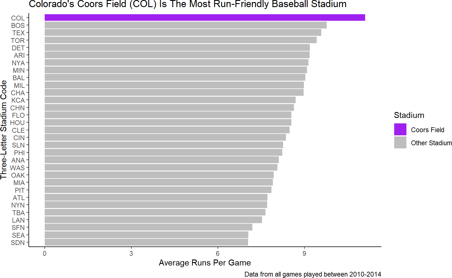
Figure 9.11: Instead of accepting the default colors, we manually supply colors to the fill scale to override the defaults.
You can find a list of all the named colors in R at http://www.stat.columbia.edu/~tzheng/files/Rcolor.pdf.
And while part of me wants to continue with some more tweaking, I will restrain myself and declare Figure 9.11 good enough - the purpose of the plot is both clear and easily digested by an external audience.
9.1.6 Taking It Further
There are too many decisions made in visualization to comprehensively cover every scenario. I strongly encourage you to take a look at Claus Wilke’s work “Fundamentals of Data Visualization” (http://serialmentor.com/dataviz/) for more tips and tricks on aligning purpose, content, structure, and formatting decisions.
Additionally (https://github.com/rstudio/cheatsheets/raw/main/data-visualization-2.1.pdf) is a link to the data visualization cheatsheet produced by Posit. Gain additional proficiency with ggplot by experimenting with the various layers, functions, scales, etc. that are described within it.
9.2 Exercises
The penguins dataset is a fun dataset made available in R by Horst, Hill, and Gorman (2020Horst, Allison Marie, Alison Presmanes Hill, and Kristen B Gorman. 2020. Palmerpenguins: Palmer Archipelago (Antarctica) Penguin Data. https://doi.org/10.5281/zenodo.3960218.). Use the below script to get penguinsDF which is needed for these exercises.
# uncomment below line to install dataset
# install.packages("palmerpenguins")
library(palmerpenguins)
library(tidyverse)
penguinsDF = penguins

penguinsDF %>% ## see a basic plot
  ggplot() +
  geom_point(aes(x = flipper_length_mm,
                 y = body_mass_g))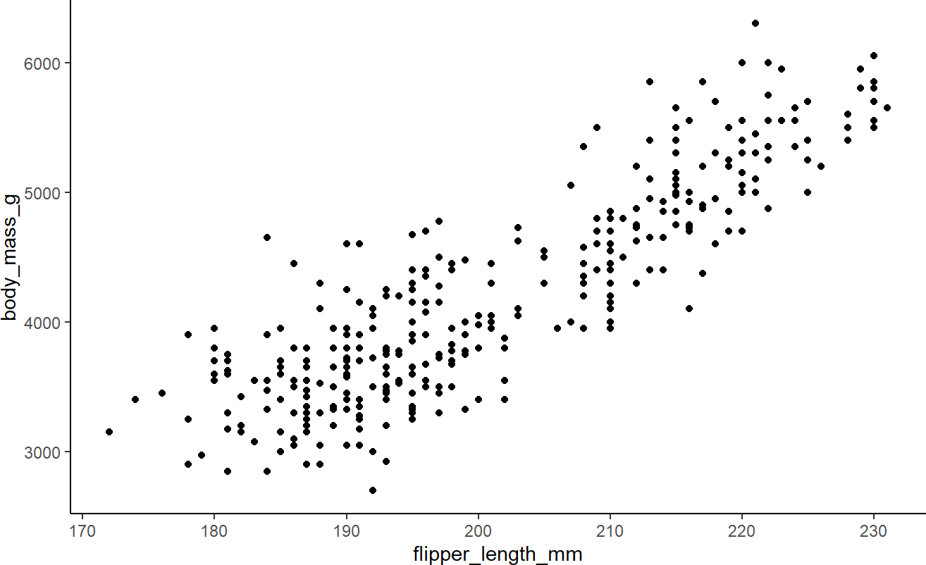
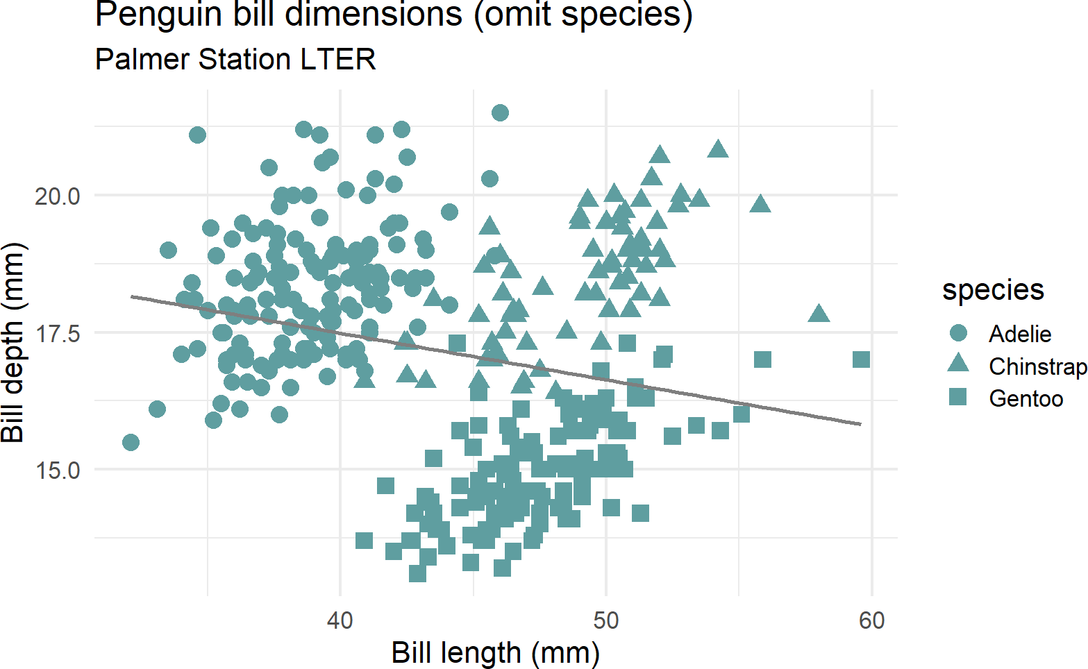
Exercise 9.1 Figure 9.12 is used to illustrate a statistical concept known as Simpson’s paradox where the overall relationship in a population misleads your judgment to make wrong conclusions by omitting an important confounding variable (in this case species). Correct this plot that falsely implies a negative relationship between bill length and bill depth by mapping both color and shape to the species column of the dataframe. Figure out how to get three linear regression lines instead of just one to highlight the positive correlation within each species of bill length and bill depth. Also, use scale_color_manual so that Adelie penguin points are colored blue, chinstrap penguins are colored dark green, and gentoo penguins are colored dark red.
penguinsDF %>%
  ggplot(aes(x = bill_length_mm,
             y = bill_depth_mm)) +
  geom_point(aes(shape = species),
             color = "cadetblue",
             size = 4) +
  labs(title = "Penguin bill dimensions (omit species)",
       subtitle = "Palmer Station LTER",
       x = "Bill length (mm)",
       y = "Bill depth (mm)") +
  theme_minimal(16) +
  geom_smooth(method = "lm", se = FALSE, color = "gray50")
Figure 9.12: This plot appears to show a negative relationship between bill length and bill depth.
Exercise 9.2 Use the penguin data to create the plot in Figure 9.13 (or something like it) with the same facets, colors, plot titles, and labels.
library(palmerpenguins)
library(tidyverse)
penguinsDF = penguins
ggplot(penguins, aes(x = flipper_length_mm,
                     y = body_mass_g)) +
  geom_point(aes(color = sex)) +
  scale_color_manual(values = c("darkorange","cyan4"), na.translate = FALSE) +
  labs(title = "Penguin flipper and body mass",
       subtitle = "Palmer Station Penguin Dimensions",
       x = "Flipper length (mm)",
       y = "Body mass (g)",
       color = "Penguin sex") +
  theme_minimal(15) +
  theme(legend.position = "bottom") +
  facet_wrap(~species)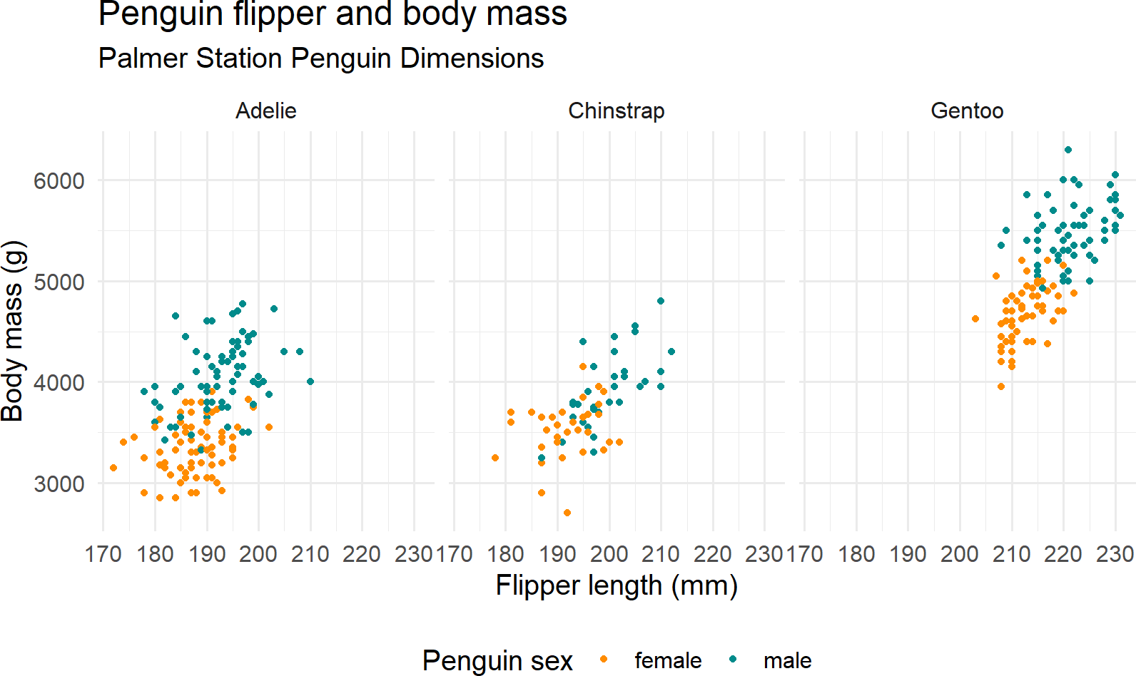
Figure 9.13: See if you can recreate this plot.