Chapter 19 Posterior Predictive Checks

Cobra snakes are known for hypnotizing their prey. Like cobras, Bayesian posteriors can fool you into submission - thinking you have a good model with small uncertainty. The seductiveness of getting results needs to be counter-balanced with a good measure of skepticism. For us, that skepticism manifests as a posterior predictive check - a method of ensuring the posterior distribution can simulate data that is similar to the observed data. We want to ensure our BAW leads to actionable insights, not intoxicating and venomous results.
When modelling real-world data, your generative DAG never captures the true generating process - the real-world is too messy. However, if your generative DAG can approximate reality, then your model might be useful. Modelling with generative DAGs provides a good starting place from which to confirm, deny, or refine business narratives. After all, data-supported business narratives motivate action within a firm; fancy algorithms with intimidating names are not sufficient on their own. Whether your generative DAG proves successful or not, the modelling process by itself puts you on a good path towards learning more from both the domain expertise of business stakeholders and observed data.
19.1 Revisiting The Tickets Example
Last chapter, we were modelling the daily number of tickets issued in New York City on Wednesdays. We made a dataframe, wedTicketsDF, that had our observed data using the code shown here:
library(tidyverse)
library(causact)
library(lubridate)
nycTicketsDF = ticketsDF

## summarize tickets for Wednesday
wedTicketsDF = nycTicketsDF %>%
  mutate(dayOfWeek = wday(date, label = TRUE)) %>%
  filter(dayOfWeek == "Wed") %>%
  group_by(date) %>%
  summarize(numTickets = sum(daily_tickets))
The generative DAG of Figure 18.13, which we thought was successful, yielded a posterior distribution with a huge reduction in uncertainty. As we will see, this DAG will turn out to be the hypnotizing cobra I was warning you about. Let’s learn a way of detecting models that are inconsistent with observation.
graph = dag_create() %>%
  dag_node("Daily # of Tickets","k",
           rhs = poisson(rate),
           data = wedTicketsDF$numTickets) %>%
  dag_node("Avg # Daily Tickets","rate",
           rhs = uniform(3000,7000),
           child = "k")

graph %>% dag_render()
Figure 18.13: A generative DAG for modelling the daily issuing of tickets on Wednesdays in New York city.
Using the generative DAG in Figure 18.13, we call dag_numpyro() to get our posterior distribution:
Figure 18.14: Posterior density for uncertainty in the rate parameter.
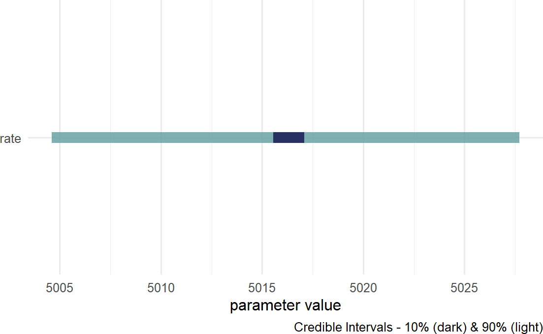
Figure 18.14 suggests reduced uncertainty in the average number of tickets issued, \(\lambda\), when moving from prior to posterior. Prior uncertainty gave equal plausibility to any number between 3,000 and 7,000. The plausible range for the posterior spans a drastically smaller range, about 5,005 - 5,030. So while this might lead us to think we have a good model, do not be hypnotized into believing it just yet.
19.1.1 Posterior Predictive Check
Here we use just one draw from the posterior for demonstrating a posterior predictive check. It is actually more appropriate to use dozens of draws to get a feel for the variability within the entire sample of feasible posterior distributions.
A posterior predictive check compares simulated data using a draw of your posterior distribution to the observed data you are modelling - usually represented by the data node at the bottom of your generative DAG. In reference to Figure 18.13, this means we simulate 105 observations of tickets issued, \(K\), and compare the simulated data to the 105 real-world observations (two years worth of Wednesday tickets).
Future versions of causact will incorporate
functionality to make these checks easier. Unfortunately, given current
functionality this is a tedious process, albeit instructive though.
Simulating 105 observations requires us to convert the DAGs joint distribution recipe into computer code - we do this going from top to bottom of the graph. At the top of the DAG is lambda, so we get a single random draw from the posterior:
lambdaPost = drawsDF %>%  # posterior dist.
  slice_sample(n=1) %>%  # get a random row
  pull(rate)  # convert from tibble to single value
lambdaPost # print value
## [1] 5015.825Note: Due to some inherent randomness, you will not get an identical lambdapost value, but your value will be close and you should use it to follow along with the process.
Continuing the recipe conversion by moving from parent to child in Figure 18.13, we simulate 105 realizations of \(K\) using the appropriate rfoo functions (causact does not support posterior predictive checks yet, so we must use R’s built-in random variable samplers, namely rpois for a Poisson random variable) :
And then, we can compare the histograms of the simulated data and the observed data:
library(tidyverse)
# make data frame for ggplot
plotDF = tibble(k_observed = wedTicketsDF$numTickets,
                k_simulated = simData)

# make df in tidy format (use tidyr::pivot_longer)
# so fill can be mapped to observed vs simulated data
plotDF = plotDF %>%
  pivot_longer(cols = c(k_observed,k_simulated),
               names_to = "dataType",
               values_to = "ticketCount")

colors = c("k_observed" = "navyblue",
           "k_simulated" = "cadetblue")

ggplot(plotDF, aes(x = ticketCount)) +
  geom_density(aes(fill = dataType),
               alpha = 0.5) +
  scale_fill_manual(values = colors)
Figure 19.1: A comparison of simulated and observed data histograms. They do not look alike at all.
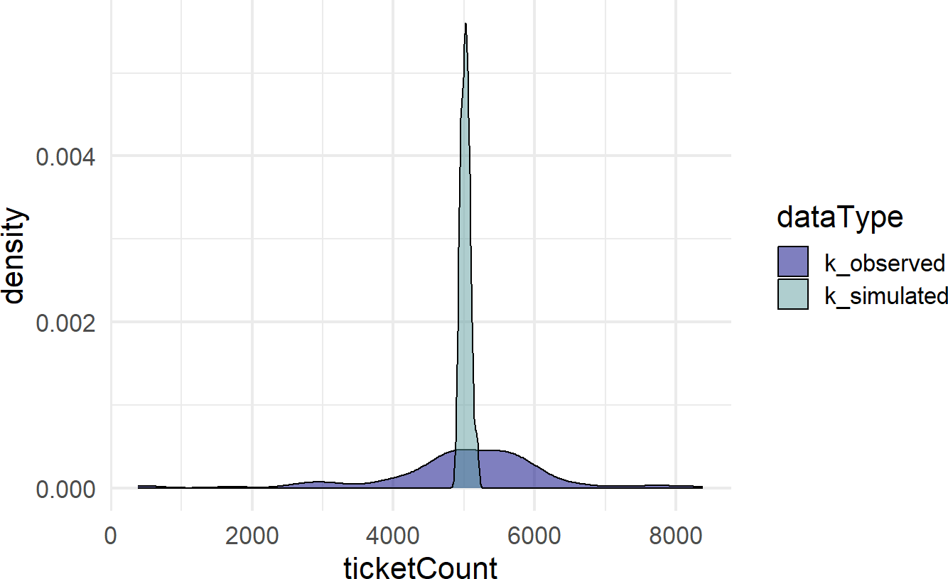
Figure 19.1 shows two very different distributions of data. The observed data seemingly can vary from 0 to 8,000 while the simulated data never strays too far from 5,000. The real-world dispersion is not being captured by our generative DAG. Why not?
Our generative DAG wrongly assumes that every Wednesday has the exact same conditions for tickets being issued. In research done by Auerbach (2017Auerbach, Jonathan. 2017. “Are New York City Drivers More Likely to Get a Ticket at the End of the Month?” Significance 14 (4): 20–25.) based off the same data, they consider holidays and ticket quotas as just some of the other factors driving the variation in tickets issued. To do better, we would need to account for this variation.
19.2 A Generative DAG That Works
There is some discretion in choosing priors and advice is evolving. Structuring generative DAGs is tricky, but rely on your domain knowledge to help you do this. One of the thought leaders in this space is Andrew Gelman. You can see a recent thought process regarding prior selection here: https://andrewgelman.com/2018/04/03/justify-my-love/. In general, his blog is an excellent resource for informative discussions on prior setting.
Let’s now look at how a good posterior predictive check might work. Consider the following graphical model from the previous chapter which modelled cherry tree heights:
library(causact)

graph = dag_create() %>%
  dag_node("Tree Height","x",
           rhs = student(nu,mu,sigma),
           data = trees$Height) %>%
  dag_node("Degrees Of Freedom","nu",
           rhs = gamma(2,0.1),
           child = "x") %>%
  dag_node("Avg Cherry Tree Height","mu",
           rhs = normal(50,24.5),
           child = "x") %>%
  dag_node("StdDev of Observed Height","sigma",
           rhs = uniform(0,50),
           child = "x") %>%
  dag_plate("Observation","i",
            nodeLabels = "x")

graph %>% dag_render()
Figure 19.2: Generative DAG for observed cherry tree height.
We get the posterior as usual:
And then compare data simulated from a random posterior draw to the observed data. Actually, we will compare simulated data from several draws, say 20, to get a fuller picture of what the posterior implies for observed data. By creating multiple simulated datasets, we can see how much the data distributions vary. Observed data is subject to lots of randomness, so we just want to ensure that the observed randomness falls within the realm of our plausible narratives.
Getting the twenty random draws, which is technically a random sample of the posterior representative sample, we place them in paramsDF:
paramsDF = drawsDF %>%
  slice_sample(n=20) ## get 20 random draws of posterior
paramsDF %>% head(5) ## see first five rows
## # A tibble: 5 × 3
## mu nu sigma
## <dbl> <dbl> <dbl>
## 1 75.6 17.0 5.49
## 2 76.7 25.6 6.80
## 3 76.9 23.6 7.64
## 4 76.4 41.4 6.27
## 5 78.4 23.5 6.08Then, for each row of paramsDF, we will simulate 31 observations. Since we are going to do the same simulation 20 times, once for each row of parameters, I write a function which returns a vector of simulated tree heights. Again, we convert the generative DAG recipe (Figure 19.2) to code that enables our posterior predictive check:
Typing ?causact::distributions into the console will
open a help screen regarding causact distributions. For
every distribution we use in causact there is corresponding
distribution in R that has the dfoo,
pfoo, and rfoo functions that yield density,
cumulative distribution, and random sampling functions, respectively.
Digging into this help file reveals that the parameterization of the
Student-t distribution in causact is based on a function in the
extraDistr package. Digging further, the rfoo
function for the Student-t distribution is rlst(). We will
call this function using extraDistr::rlst() instead of
running library(extraDistr) and then using
rlst(). More generally, if you want a specific function
from a specific package without loading the package using
library(), use the convention
packageName::functionName.
## function to get simulated observations when given
## a draw of nu, mu, and sigma

# uncomment below if you see error that rlst() not found
# install.packages("extraDistr")
# the install might require you to restart R session
# in this case, you may have to rerun lines from above

simObs = function(nu,mu,sigma){
  # use n = 31 because 31 observed heights in the data
  simVector = extraDistr::rlst(n = 31,
                               df = nu,
                               mu = mu,
                               sigma = sigma)
  return(simVector)
}
The below code tests the function is working as expected (always do this after writing functions):
##  [1]   508.0254   789.3907   507.5362   494.6193   391.6364   517.1592
##  [7]   496.5111   509.3466   501.2697   483.1447  7582.7321   497.8540
## [13]   516.1537   491.6279   515.2729   568.7962   505.1205   493.1260
## [19]   520.4595   495.2626   502.2957   491.7358   506.6174   499.4885
## [25]   480.5368   514.0040   499.0246   504.6065   500.9923   495.8710
## [31] -7901.6642
We now get 31 observations for each row in paramsDF using some clever coding tricks that you should review slowly and unfortunately cannot be avoided:
See
https://jennybc.github.io/purrr-tutorial/ls03_map-function-syntax.html
for a nice tutorial on how the pmap() function (parallel
map) works.
library(tidyverse)
simsList = pmap(paramsDF,simObs)

## give unique names to list elements
## required for conversion to dataframe
names(simsList) = paste0("sim",1:length(simsList))

## create dataframe of list
## each column corresponds to one of the 20
## randomly chosen posterior draws.  For each draw,
## 31 simulated points were created
simsDF = as_tibble(simsList)

simsDF ## see what got created
## # A tibble: 31 × 20
## sim1 sim2 sim3 sim4 sim5 sim6 sim7 sim8 sim9 sim10 sim11 sim12 sim13
## <dbl> <dbl> <dbl> <dbl> <dbl> <dbl> <dbl> <dbl> <dbl> <dbl> <dbl> <dbl> <dbl>
## 1 77.0 71.1 76.4 80.6 74.0 66.3 73.2 68.9 79.3 82.3 90.9 87.0 71.1
## 2 81.4 88.8 83.0 77.8 79.4 69.0 84.2 71.0 80.8 77.8 72.3 88.0 117.
## 3 75.9 60.2 76.5 74.4 74.7 79.2 73.1 67.2 66.2 87.1 80.1 71.8 86.8
## 4 82.1 85.3 90.8 74.5 70.8 79.0 68.4 83.9 77.2 78.3 92.4 72.4 78.4
## 5 84.3 91.1 74.1 68.6 84.3 81.6 68.1 73.7 84.5 77.6 80.1 75.2 69.5
## 6 70.3 75.6 71.5 71.6 78.2 74.5 56.1 80.9 68.8 69.3 66.7 69.3 74.8
## 7 65.4 68.4 83.9 73.3 74.2 76.3 87.4 67.4 79.3 79.1 61.9 75.9 70.0
## 8 65.8 89.8 69.7 87.7 85.3 71.8 68.1 71.0 78.8 70.4 75.6 77.3 85.0
## 9 77.2 82.8 55.7 84.4 87.8 76.1 78.1 69.3 70.1 73.1 70.1 70.7 71.4
## 10 81.5 78.6 86.7 85.8 79.3 80.6 82.8 68.7 83.0 76.1 66.9 74.3 83.3
## # ℹ 21 more rows
## # ℹ 7 more variables: sim14 <dbl>, sim15 <dbl>, sim16 <dbl>, sim17 <dbl>,
## # sim18 <dbl>, sim19 <dbl>, sim20 <dbl>## create tidy version for plotting
plotDF = simsDF %>%
pivot_longer(cols = everything())
## see random sample of plotDF rows
plotDF %>% slice_sample(n=10) ## # A tibble: 10 × 2
## name value
## <chr> <dbl>
## 1 sim2 88.8
## 2 sim7 69.8
## 3 sim2 73.9
## 4 sim20 76.8
## 5 sim2 68.0
## 6 sim7 78.0
## 7 sim7 68.4
## 8 sim6 78.7
## 9 sim14 72.4
## 10 sim8 69.1And with a lot of help from googling tidyverse plotting issues, one can figure out how to consolidate the 20 simulated densities with the 1 observed density into a single plot (see Figure 19.3). The goal is to see if the narrative modelled by the generative DAG (e.g. Figure 19.2) can feasibly produce data that has been observed. The following code creates the visual we are looking for:
obsDF = tibble(obs = trees$Height)

colors = c("simulated" = "cadetblue",
           "observed" = "navyblue")

ggplot(plotDF) +
  stat_density(aes(x=value,
                   group = name,
                   color = "simulated"),
               geom = "line",  # for legend
               position = "identity") + #1 sim = 1 line
  stat_density(data = obsDF, aes(x=obs,
                   color = "observed"),
               geom = "line",
               position = "identity",
               lwd = 2) +
  scale_color_manual(values = colors) +
  labs(x = "Cherry Tree Height (ft)",
       y = "Density Estimated from Data",
       color = "Data Type")
Figure 19.3: A posterior predictive check for our model of observed cherry tree heights.
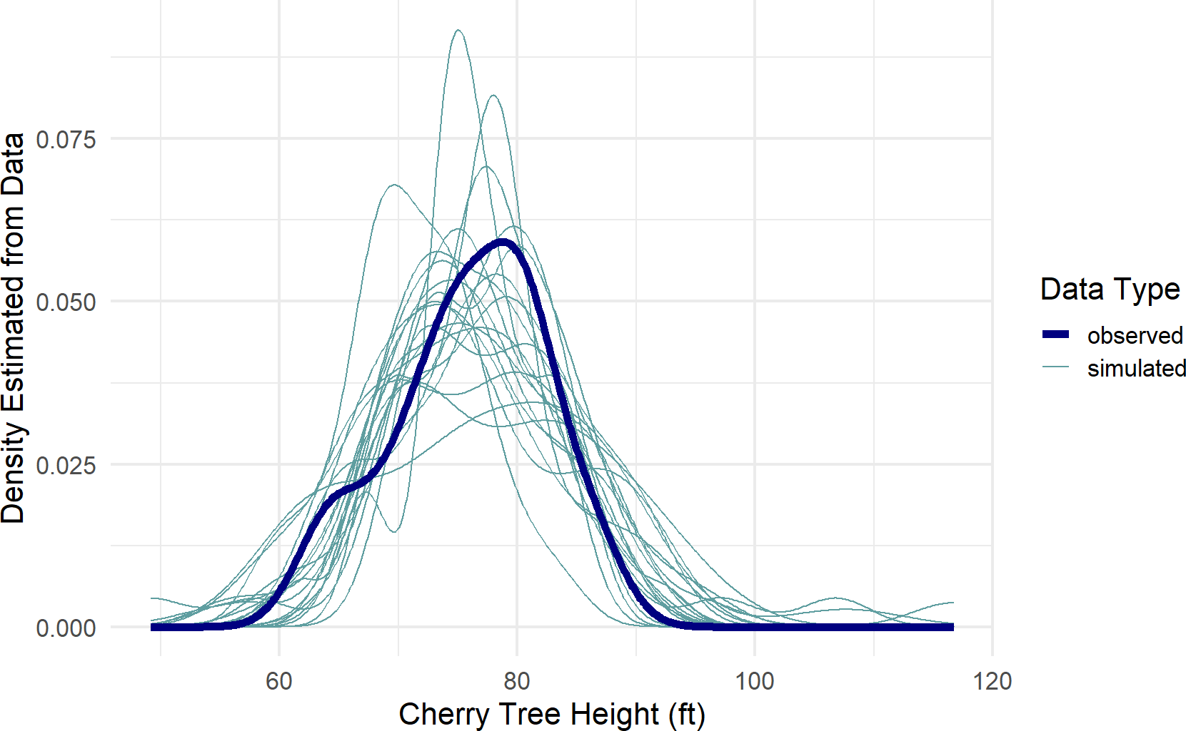
Figure 19.3, a type of spaghetti plot (so-called for obvious reasons), shows 21 different density lines. The twenty light-colored lines each represent a density derived from the 31 points of a single posterior draw. The thicker dark-line is the observed density based on the actual 31 observations. As can be seen, despite the variation across all the lines, the posterior does seem capable of generating data like that which we observed. While this is not a definitive validation of the generative DAG, it is a very good sign that your generative DAG is on the right track.
Despite any posterior predictive success, remain vigilant for factors not included in your generative DAG. Investigating these can lead to substantially more refined narratives of how your data gets generated. For example, in the credit card example of the causact chapter, our initial model ignored the car model data. Even with this omission, the model would pass a posterior predictive check quite easily. Only by including car model data, as might be suggested by working with business stakeholders, did we achieve a much more accurate business narrative. Do not be a business analyst who only looks at data, get out and talk to domain experts! See this Twitter thread for a real-world example of why this matters: https://twitter.com/oziadias/status/1221531710820454400. It shows how data generated in the real-world of emergency physicians can only be modelled properly when real-world considerations are factored in.
19.3 Exercises
Exercise 19.1 The following code will extract and plot the number of runs scored per game at the Colorado Rockies baseball field in the 2010-2014 baseball seasons.
Figure 19.4: Histogram of runs scored per game at the Colorado Rockies stadium.
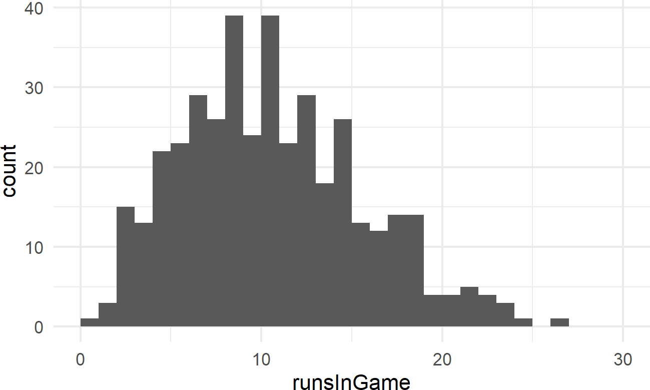
Runs scored per game is a good example of count data. And often, people will use a Poisson distribution to model this type of outcome in sports.
library(dplyr)
library(causact)
graph = dag_create() %>%
  dag_node("Avg. Runs Scored","rate",
           rhs = uniform(0,50)) %>%
  dag_node("Runs Scored","k",
           rhs = poisson(rate),
           data = baseDF$runsInGame) %>%
  dag_edge("rate","k") %>%
  dag_plate("Observation","i",
            nodeLabels = "k")

graph %>% dag_render()
Figure 19.5: Generative dag for modeling runs scored as a Poisson random variable.
Using the generative DAG of Figure 19.5, write the code to plot a posterior predictive check for this generative DAG. You will notice that the simulated data does not seem consistent with the observed data (i.e. this model is deficient). Comment on what intervals of values seem to be either over-estimated or under-estimated.